


In the wonderful world of design, there aren’t too many hard and fast rules.
That’s part of what makes the work so much fun: you’re not always confined to a strict set of requirements or standards, and there’s plenty of opportunity to experiment with different ideas to your heart’s content!
But it takes time to develop an eye for design, and if you're brand new to it, the seemingly limitless possibilities can feel a little daunting, to say the least.
So to help you get started, we’ve created a list of some essential visual design best practices—and included illustrations and examples from the web. Today, we’re just focusing on “visual design” tips. Think of visual design as the graphic design side of digital design: it’s about shaping the layout, look, and feel of digital products.
Once you’ve digested this introduction, why not check out our more detailed visual design tips on designing for inclusion and accessibility?
1. Do Learn How to Create Effective Color Palettes
Think of any big brand (Target, Facebook, Google) and you can probably remember the colors associated with it. Color is a powerful visual design tool, and the palette used on a website can have a huge effect on how we feel about a company or its products.
Learning how to pair colors will help you to create designs that are visually pleasing, memorable, and add to the user’s overall experience of the site. But with a practically infinite number of color combinations, how do you even begin to build a color palette?
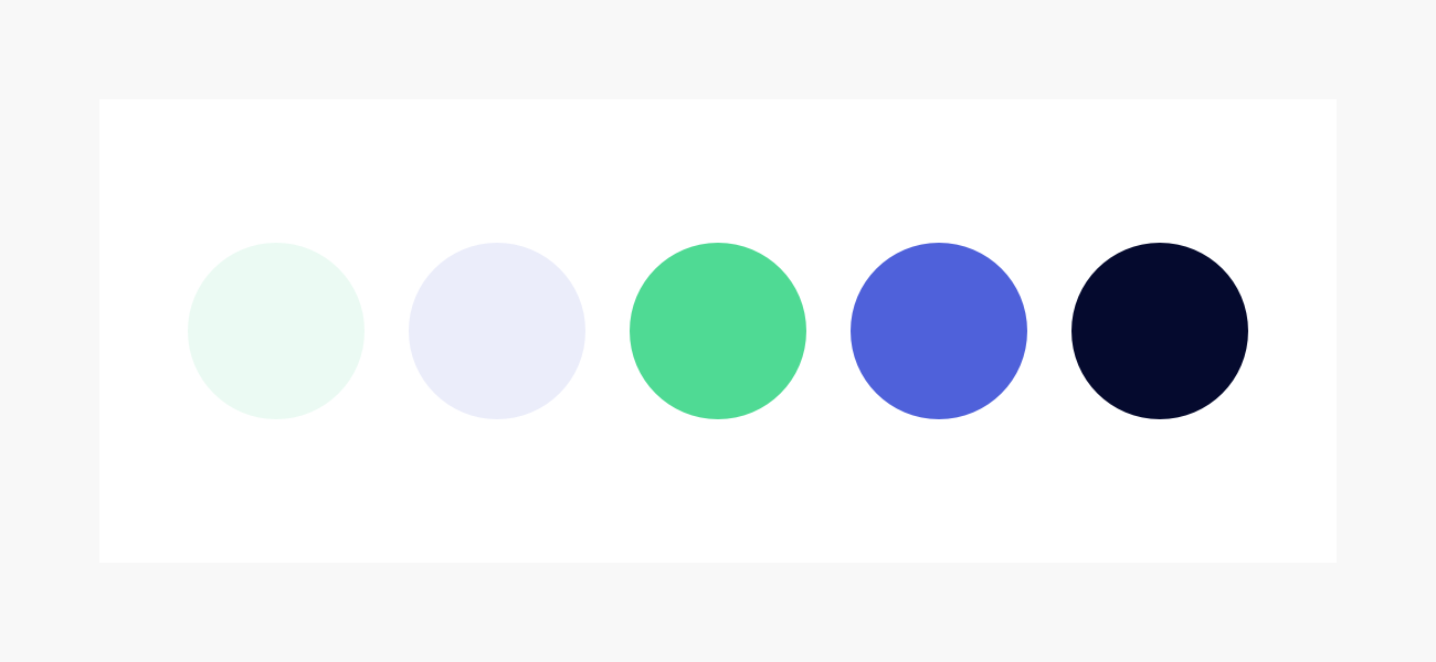
Start with the messages and values you want to associate with your product. Do you want to be stalwart and trustworthy, youthful and energetic, or cutting-edge and daring? Choose two or three keywords and begin by choosing one or two “brand colors” that align with those concepts and look good together. You can build your palette from there!
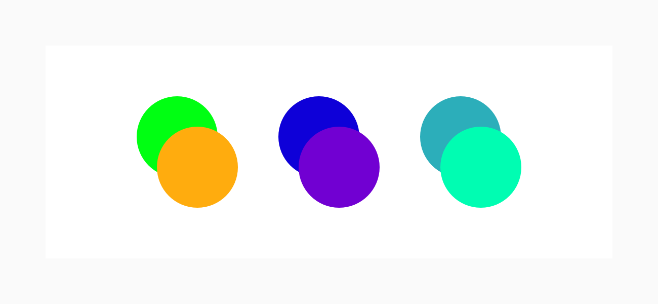
When choosing additional colors, remember to include neutrals—colors that are very close to white and black. These will be very useful as background colors. However, try to make sure that your neutrals have a connection to the rest of your palette: in the illustration above, we've taken the blue color and chosen a very light blue and a very dark blue as neutrals.
Finally, consider adding an accent color—something contrasting that you could use to pick out small elements like links and buttons.
Effective Color Palettes in Action: Otherland
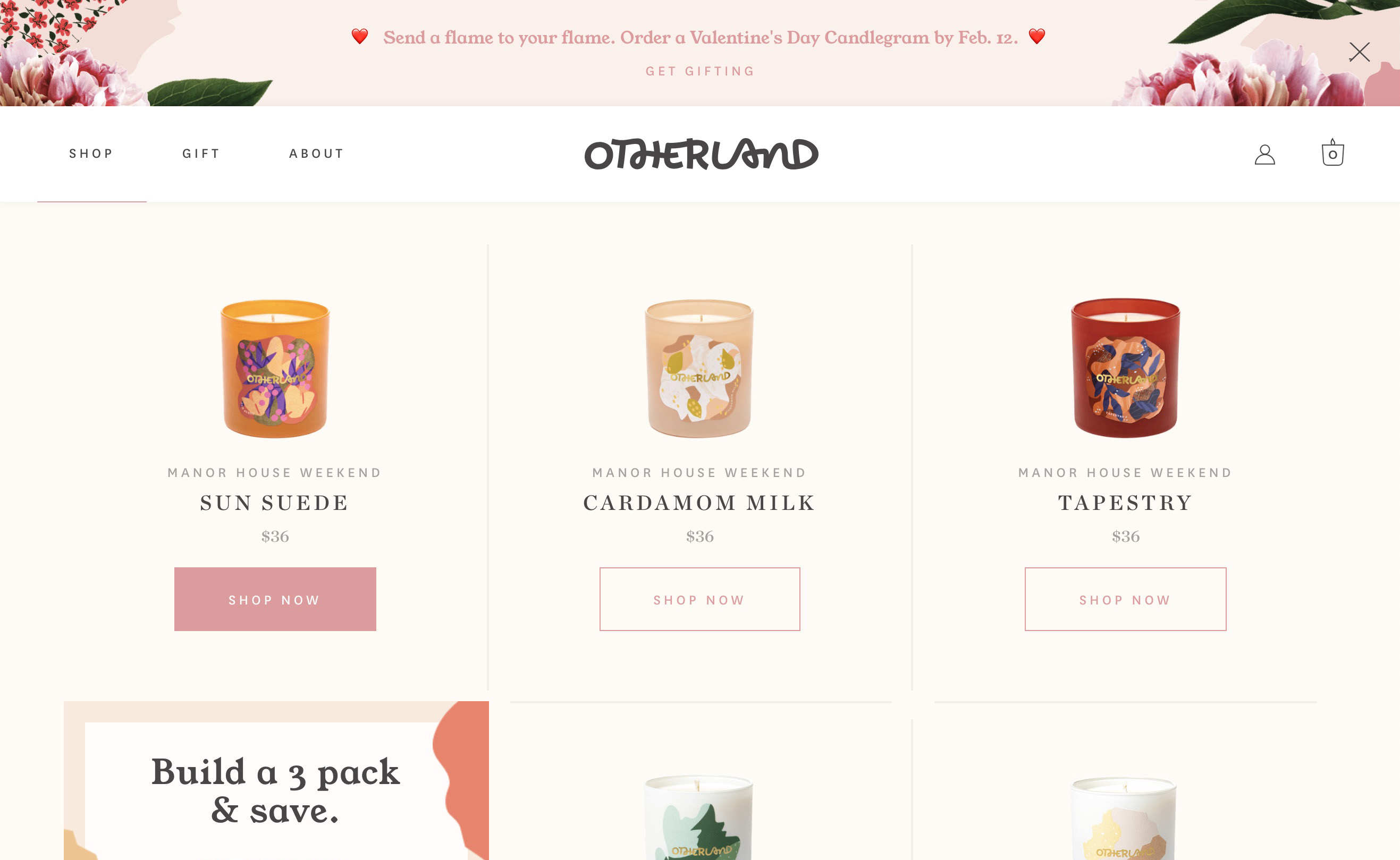
The high-end candle company Otherland combines pink as their brand color and gold as a highlight color. The result is a whimsical, luxurious vibe that will appeal to its primary market of upscale women. Notice how important the off-white neutral is in the background—it binds together the other color choices.
Bonus Resource
Want more practical tips on building color palettes? Check out our 11 Tips on Building Great Color Palettes!
2. Don’t Forget Diverse Color Vision
Did you know that about 1 in 12 boys and men, and 1 in 200 girls and women, suffer from some form of colorblindness? That amounts to 5% of all web users!
Given how central digital products have become in everyday life, it’s more important than ever to ensure that your designs are still usable for someone with limited color vision, or another visual impairment.
The most common forms of colorblindness make it hard for some users to tell the difference between these colors:
- green and orange
- red and green
- blue and purple
- red and brown
- blue and green
It’s good practice to avoid using these combinations directly next to, or on top of, one another. You’ll also want to make sure not to rely on color alone to label a function or command.
For example, if you use a red border to indicate that a password was entered wrongly, add some supporting text that communicates that message in a second way (e.g. “Wrong password”). By doing this, if someone can’t see the color red, they’ll still be able to figure out what’s happened and what action they need to take next.
Diverse Color Vision In Action: New South Wales Government
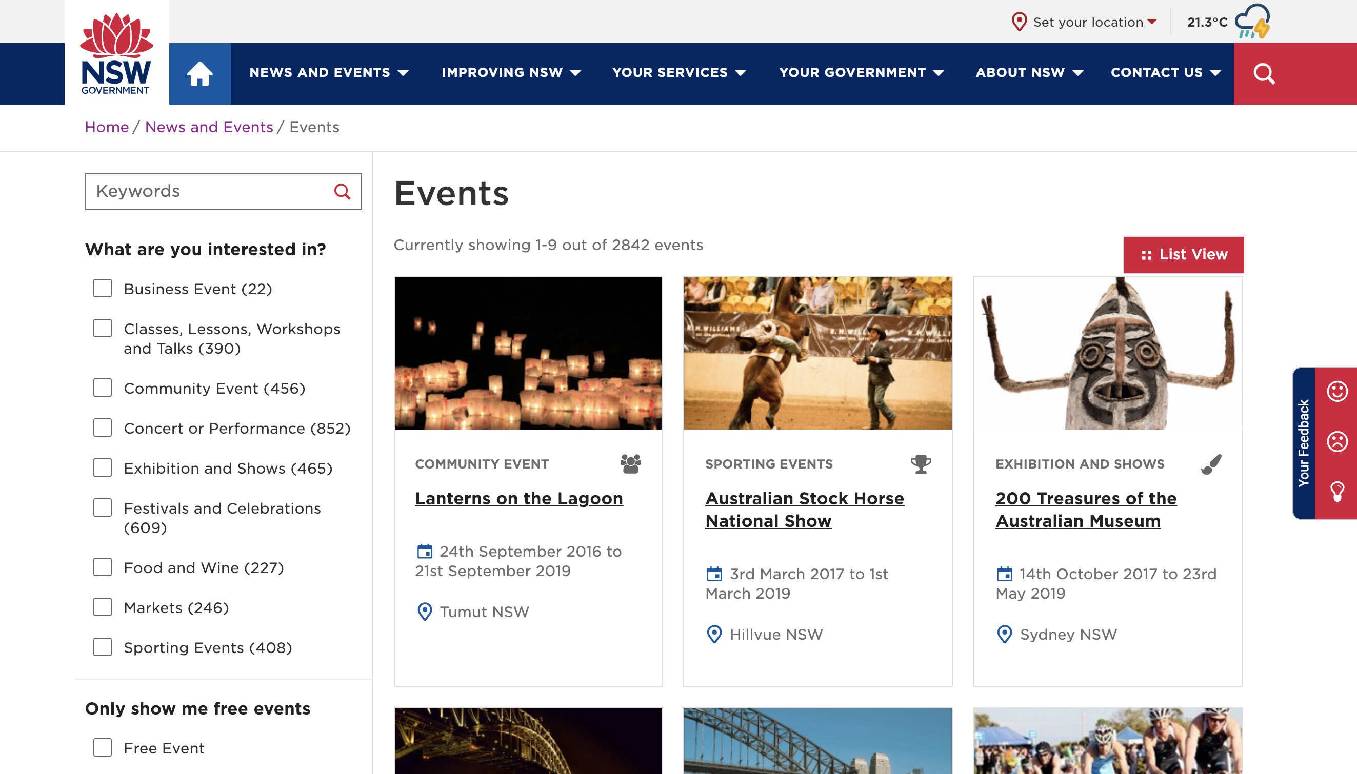
The government of New South Wales recently redesigned their website to make sure it was accessible to all visitors. You’ll notice the colors are bold and vibrant enough to pass accessibility contrast guidelines, and the text size is large and very easy to read.
Bonus Resources
Wondering if your design is inclusive? You can also check out 40 tips we’ve compiled on making sure your designs are inclusive and accessible.
Text contrast is another big factor when choosing colors—plug in your text color and background to Contrast Checker and see how your design scores!
3. Do Be Deliberate in Picking your Typefaces
Typography plays just as big a part in how something looks as a color palette does, but the effect is often subtler and more subliminal. It’s tempting to just pick a font you like and are familiar with—graphic design great Massimo Vignelli only used six typefaces in all his work!
But since most of us aren’t Massimo Vignelli, it’s important to be deliberate and thoughtful when choosing fonts, and to follow the same process of thinking through how your choice of type relates to the keywords for your project.
First, consider what types of font will match the tone and purpose of your project. For example, if you’re designing a landing page for a cutting-edge tech company, you’ll probably want to avoid any typeface that looks old-fashioned—so a sans-serif could work best.
But if you’re designing an app for a museum of ancient history, it might be appropriate to incorporate fonts that have a classical and historical look—like a serif typeface.
Finally, ensure that whatever you choose is legible for the user and easy to read in longer blocks of text. Script fonts and other novelty lettering can be fine, as long as it’s used only in small areas, like a logo.
Font Selection In Action: Bolden
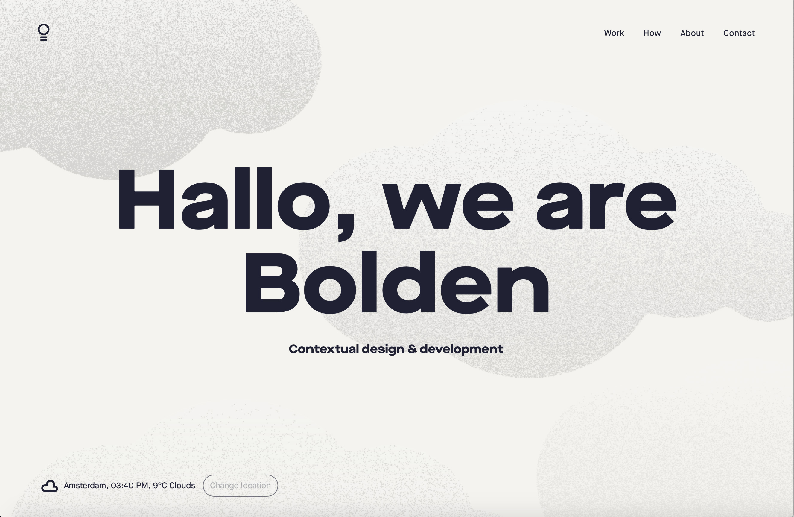
Check out the name of this design firm, Bolden, and how the “boldness” of their company is reflected both in the extra bold typeface choice (the font is Maison Neue), and in how they’ve used that typeface—in large letters, with high contrast against the background.
Bonus Resource
Ever wondered what font your favorite website is using? Fontface Ninja is a free chrome extension that will allow you to identify, sample, and bookmark any font you see online.
4. Don’t Be Afraid to Pair Fonts
Once you’ve gotten comfortable picking fonts for your designs, you can experiment with using multiple fonts. Two fonts should be enough for 99% of cases.
There’s plenty of ways to go about pairing fonts, but to start, you can think of one as your primary font that you’ll use for body copy, and another as the accent font you’ll use for titles. When done effectively, font pairing can help your designs look more thoughtful and distinctive.
The most common way of pairing fonts is to combine a serif and a sans-serif. For detailed tips on good combinations, check out Typewolf!
Font Pairing In Action: Book of the Month
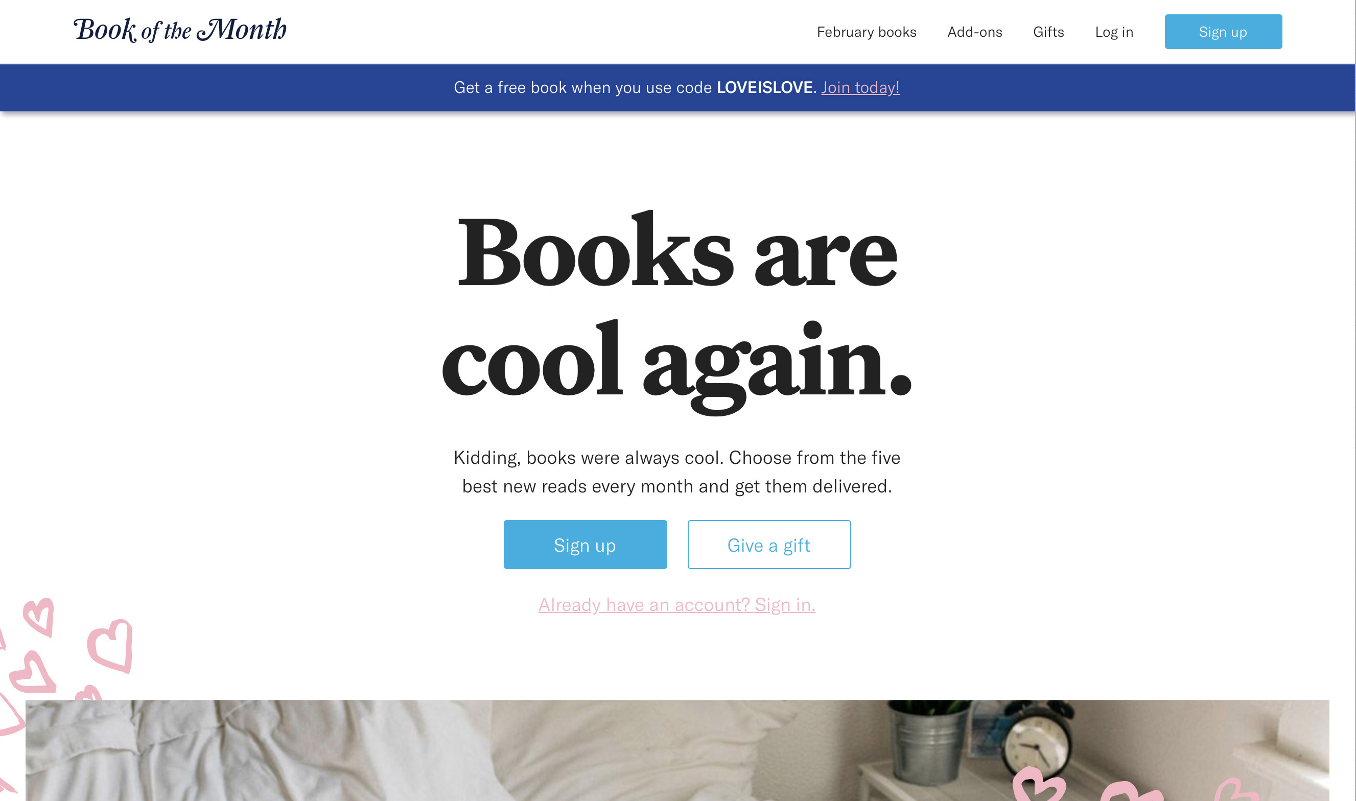
Notice how Book of the Month, a book subscription service, uses a serif font (Untitled) for titles and headers, and a sans serif font (GT America) for the body. The result is a visually pleasing combination—both easy to read, and reflective of the literary nature of the product.
Bonus Resource
Practice being a typeface matchmaker! Typeconnection is a “typography dating game”. Practice pairing up typefaces, and see how they look together.
[MID_ARTICLE_CTA]
5. Do Use Images to Break Up Text
Along with your color and font choices, the images you use can enhance the user’s experience and help set the intended tone. There’s no shortage of image ideas out there: photos, illustrations, infographics, diagrams, icons... the list goes on!
But you’ll want to make sure each visual element adds something important and functional to your design solution: images shouldn't just be decorative. Also, aim to create and curate images that play well with your keywords, color palette, and fonts.
Image Use In Action: Plated
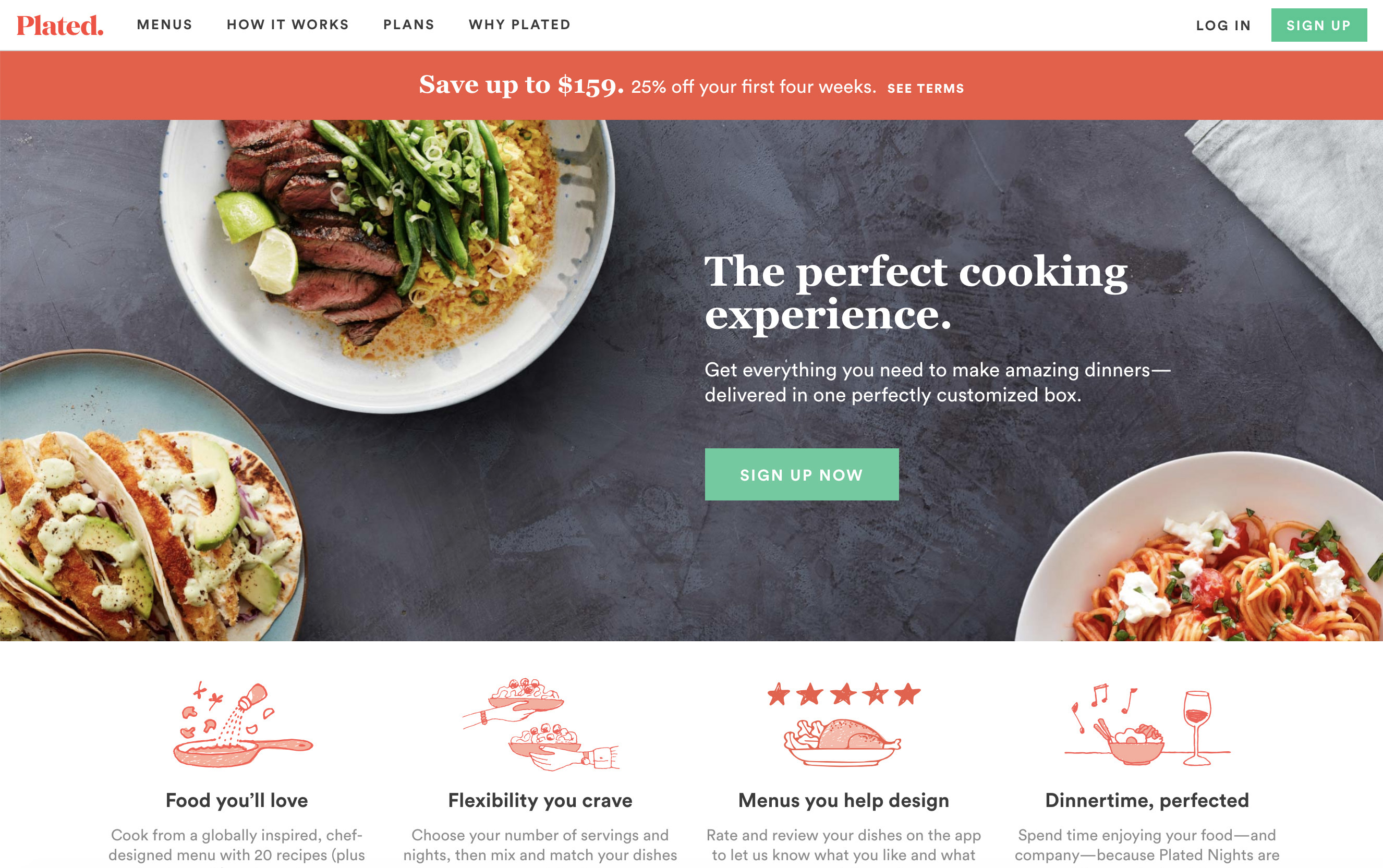
Plated, a meal kit delivery startup, stocked their landing page with delicious meals: a kind of aspirational “you could be eating this” incentive for potential customers.
They have lots of photos of families and couples cooking together, aiming to position Plated as a bonding activity as well as a meal service. The company’s mission is to provide “the perfect cooking experience”, and the images of happy families and beautiful meals reinforces that perception.
Bonus Resource
For some amazing high-quality (and completely free) stock photos, check out Unsplash, Burst, and StockSnap!
6. Don’t Source Your Images Irresponsibly
When you’re just starting out as a designer, it can be hard to know where to find good quality photos to use in your design. You might find yourself drooling over a beautiful product photo, or a stunning landscape image on your favorite website.
But remember that many of the images you find by browsing services like Google Images have been professionally created and art-directed for clients. They’re likely to be copyrighted, meaning that you shouldn’t just copy and paste them into your own projects.
However, there are some great free stock photo sites available to you, including Unsplash, Burst, and StockSnap. Finally, remember your smartphone! With a bit of planning, and tools like light tents, you can create your own high-quality images for projects.
Image Sourcing In Action: Unsplash
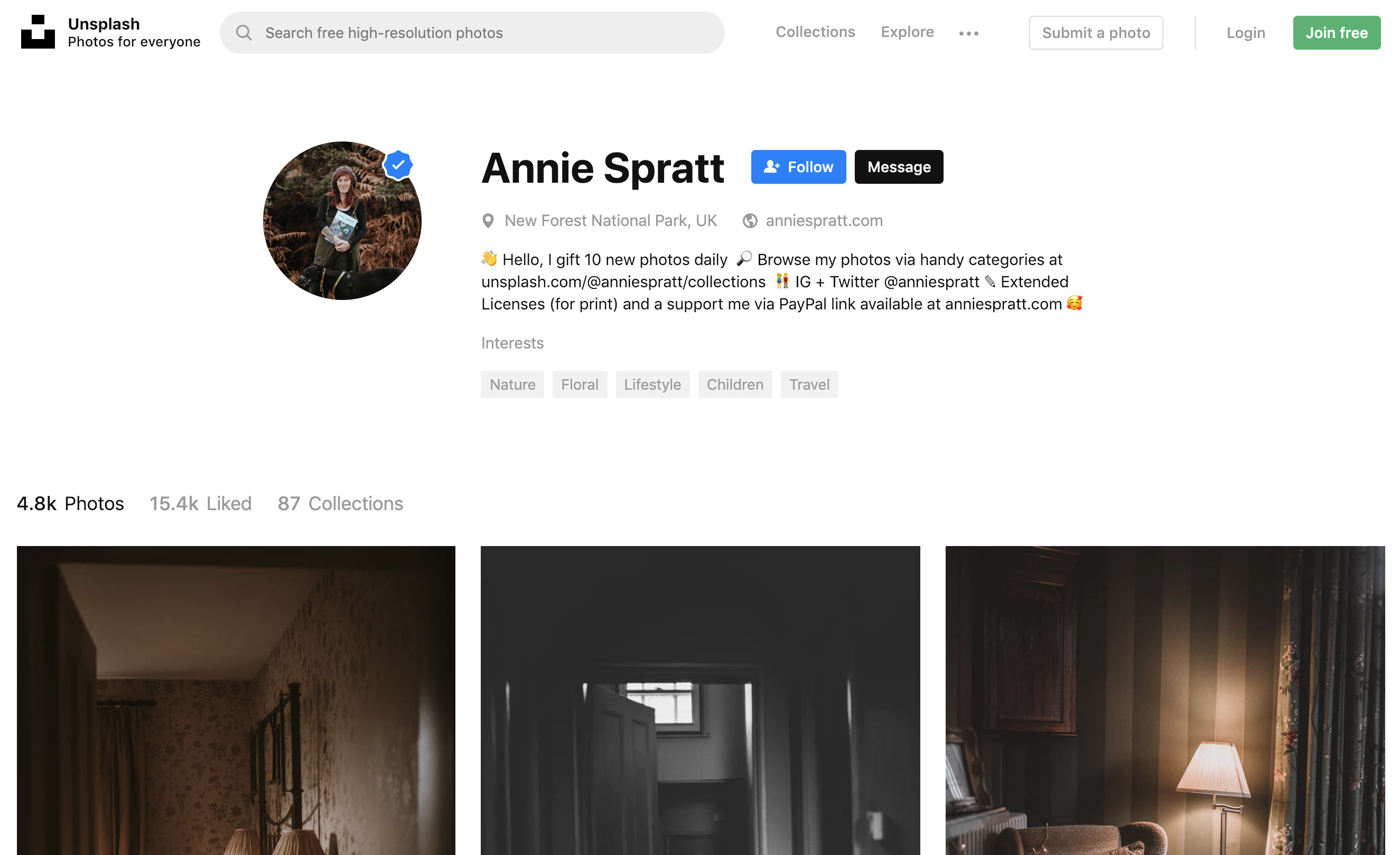
One of the challenges of using stock photos, especially free ones, is finding a set of images that has a consistent look and feel.
A pro tip for using services like Unsplash is to identify the work of a single photographer whose style is a good match for your project, and then use only images shot by that person in your design.
Bonus Resource
For even more photo resources, check out this master list.
7. Do Create a Coherent Layout
Knowing how to choose individual elements like colors, fonts, and images is important—but you also need to know how to use these elements in a page layout.
As well as making your design look sleek and professional, a good layout also creates clear structure, and helps bring the user’s attention to the right place. There are countless ways to lay out content on a page, so explore the options through lots of quick sketches on paper.
Whichever option you choose, make sure that the layout draws the user’s eye to the most important element. If that’s a product page, it might be a photo of the item. If it’s a landing page, it could be the “Sign up” button.
Put yourself in the user’s shoes, and observe how your eye travels around the design. Or even better, get a friend to help test it!
Layout In Action: MakeSpace
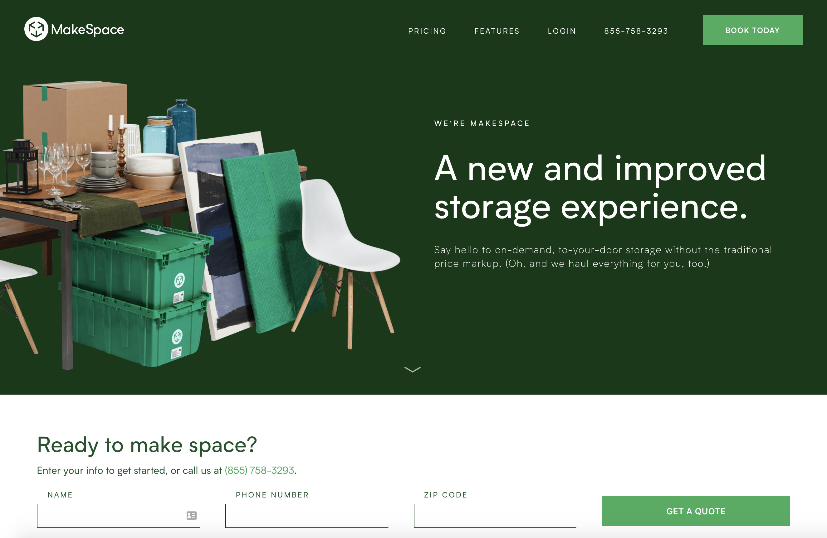
Like all the best landing pages, MakeSpace arrange all the visual elements simply and with clear points of alignment.
The initial focus for the user is clear—the company’s value proposition (“A new and improved storage experience”).
In addition to that, there are clear buttons (“Book Today”, “Get a Quote”) that allow the user to take the next step, and nice use of supporting images.
Bonus Resource
Check out how new eye-tracking software validates Z-pattern and F-pattern layouts in web design.
8. Do Use a Grid

As a new designer, the grid will become your new best friend. In essence, grids are systems for organizing content: columns (and sometimes rows) that are evenly spaced across a page.
Grids help your design look professional, uniform and well-aligned: observing the grid will add consistency and structure to your layout, as well as making it easier for the user to understand and navigate.
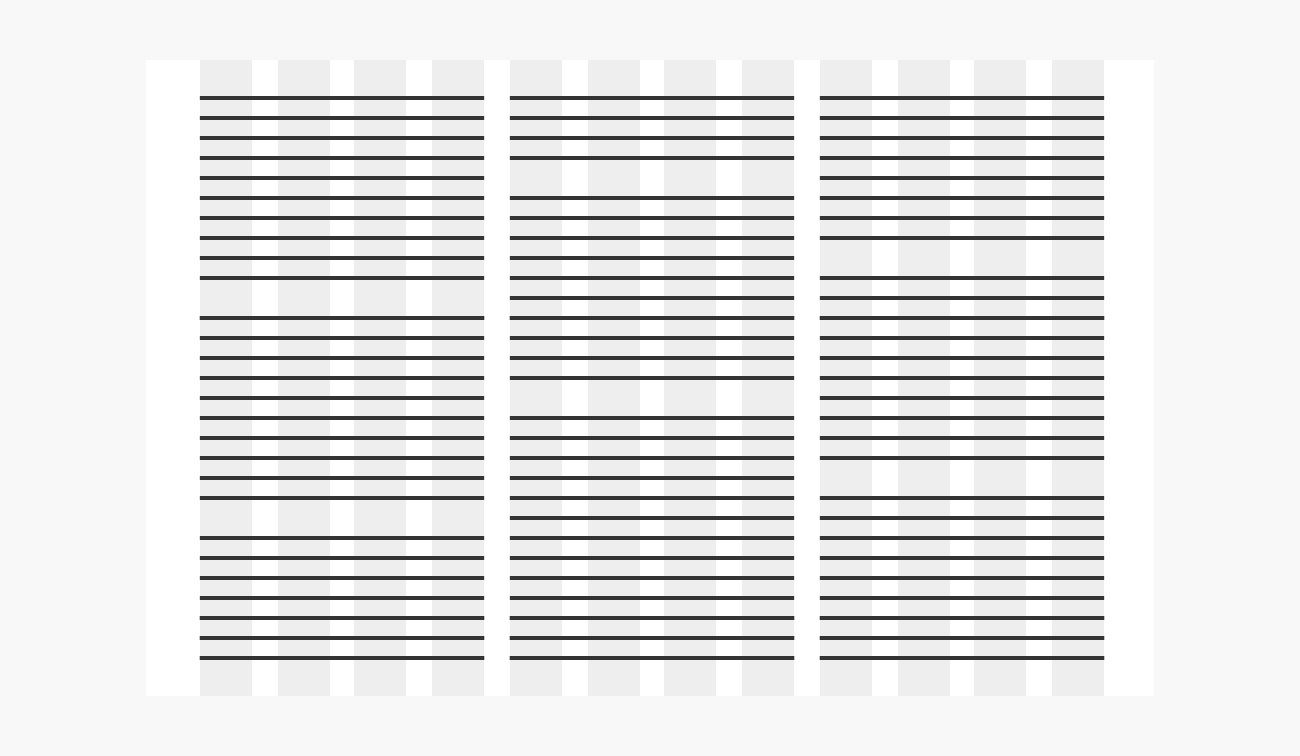
Grid Use In Action: The New York Times
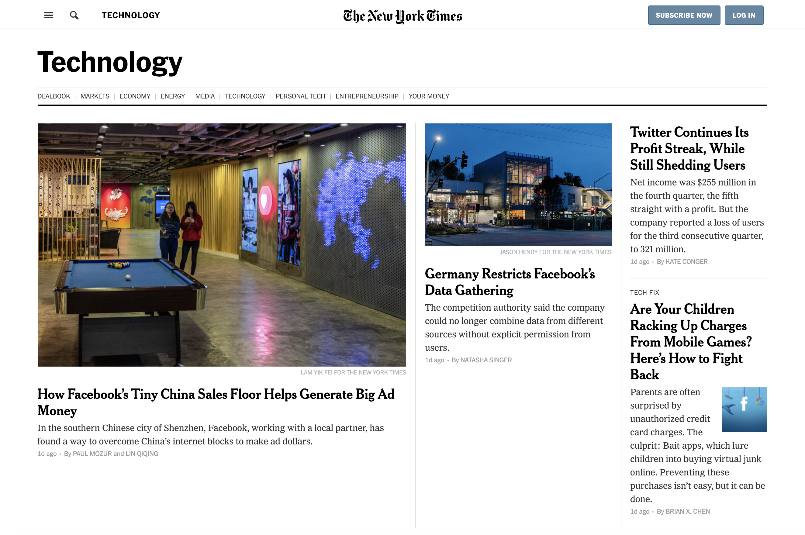
Exploring newspaper websites can be a good way of understanding the power of grid use. Grids began in print, of course, and newspapers have been using them for centuries.
In this example, The New York Times use a grid to allow them to display a top story while still having links to secondary stories in columns on the right. Also, notice how the text columns align with the navigation bar elements at the top of the screen. Grids are most effective when used consistently like this.
Bonus Resource
Can’t get enough of grids? Neither can we. Check out our deep dive on the history of grids!
9. Don’t Neglect Visual Hierarchy
Visual hierarchy is about more than just bringing the user’s attention to the most important element in the layout. It’s also about establishing the relative importance of all the other elements in a page.
In this blog post, you might have noticed that the numbered headings are larger than the body text, and separated from the previous section by some white space.
This use of a more visually prominent style for headings bumps them up the hierarchy, helping the brain understand that these are waymarkers in the content. You can control visual hierarchy by using a combination of color, size, and spacing in particular.
Visual Hierarchy In Action: Google Home
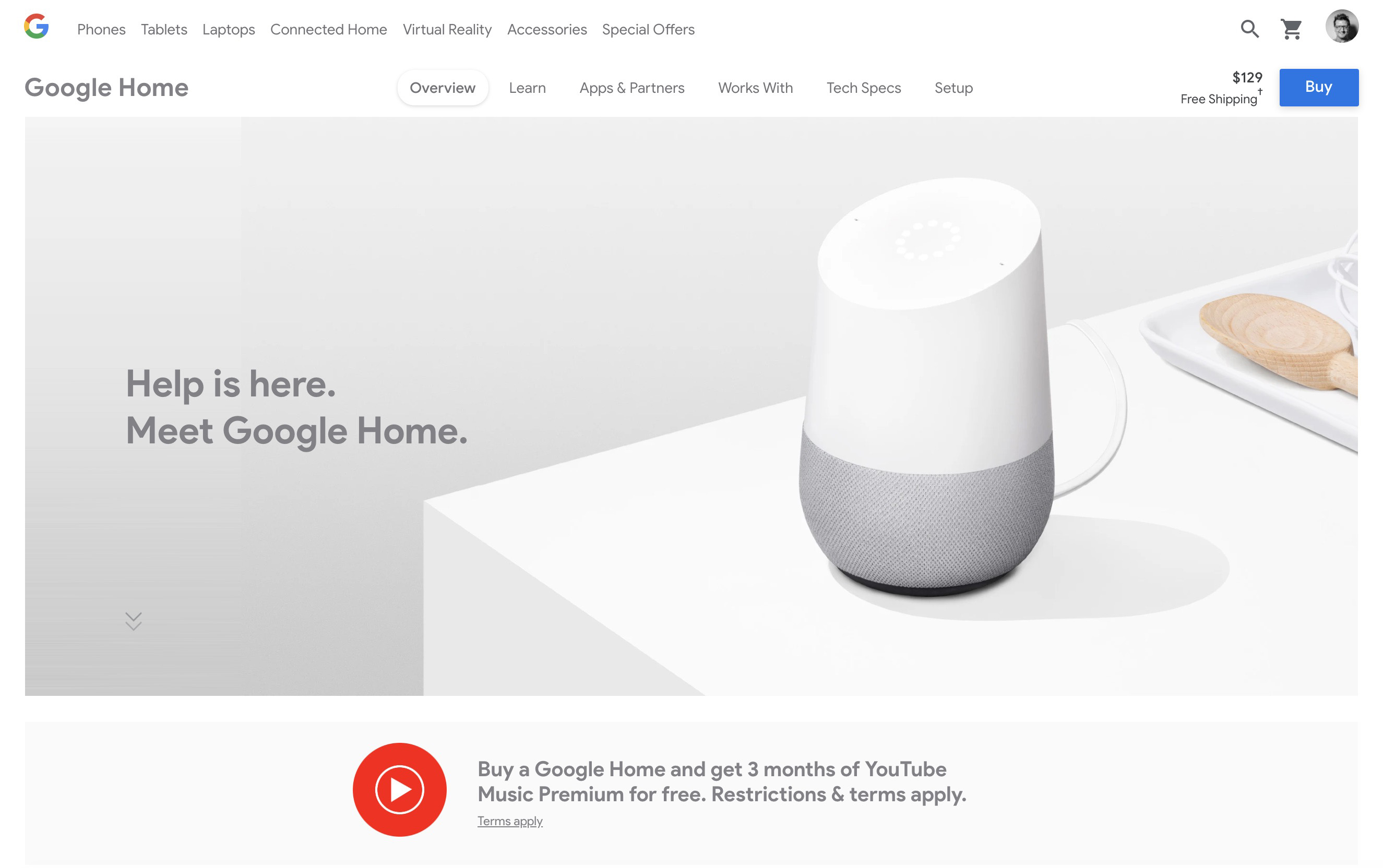
Although this landing page might look pretty straightforward at first glance, notice how the visual hierarchy is managed so that the user’s eye follows a subtle smile-shaped journey.
The eye might first land on the distinctive “G” logo in the upper left corner before skipping down to the copy (“Meet the Google Home”). Next, guided by the table edge in the photo, the eye swings back up to the prominent “Buy” button in the top-right corner.
This visual journey gives the user all the essential information about Google Home (who makes it, what it does, how to buy it) without even having to scroll further down the page.
Bonus Resource
Check out this article from Awwwards on how to establish a visual hierarchy in web design.
10. Do Make Ample Use of Whitespace
It’s only natural as a new designer to want to apply all your new knowledge at once. You might find yourself cramming as many images and text blocks as you can onto a single page!
But just as music is made up of silences and pauses as well as notes, the spaces between visual elements are just as important as the elements themselves.
By giving elements like images and text blocks plenty of surrounding whitespace, you’ll help the user identify groupings of information, and therefore help them more easily understand the content.
Using generous whitespace is also one of the simplest ways to make your designs look cleaner and more elegant.
Whitespace In Action: Apple
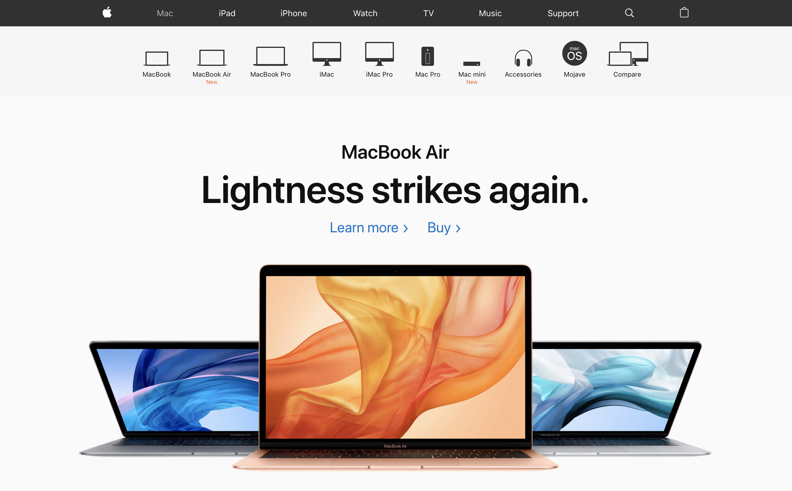
Apple could be called the queen of whitespace. The spacious presentation of this landing page reflects the minimalism and artistry of their products.
Notice especially how the whitespace around Apple’s product photos and descriptions doesn’t take away emphasis. On the contrary—surrounding an element with space gives it extra visual importance.
Bonus Resource
Did you know there’s actually two kinds of whitespace? Check out this piece from Vandelay Design on micro and macro whitespace.
Thanks for reading!
We hope you've found this introductory guide to visual design best practices helpful.


%20(1)-min.png)


