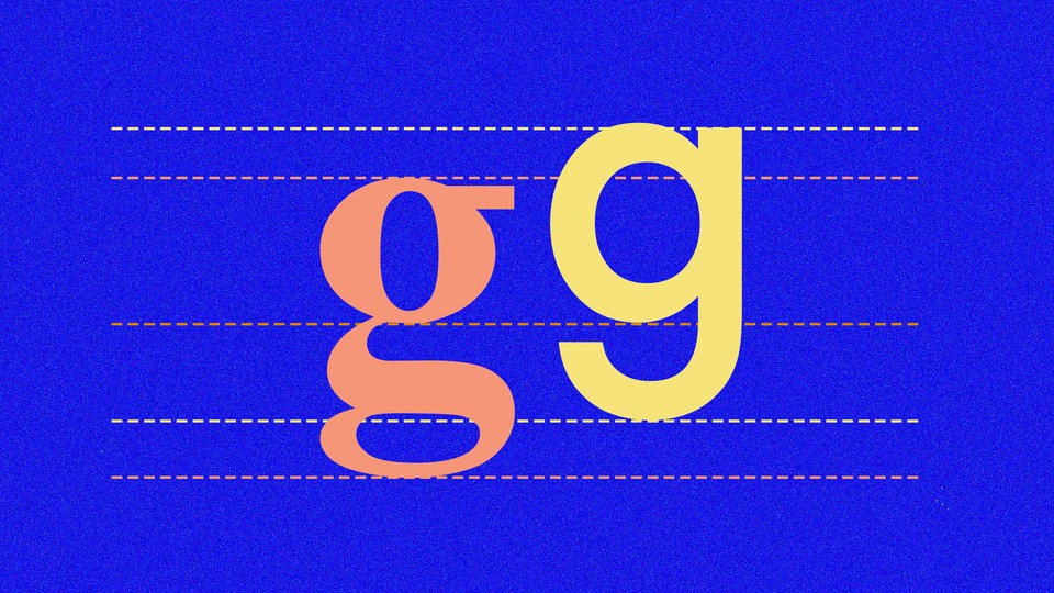
In a recent study delightfully titled “The Devil’s in the ‘g’-Tails,” researchers at Johns Hopkins University found that most people are unaware of the common form of the lowercase “g” that appears in books. It looks like this: g. If you glossed right over that, notice that the letter has two closed loops, distinct from the way “g” is usually written by hand.
“Nobody seemed to know what I was talking about,” Michael McCloskey, a cognitive scientists at Hopkins, recalls of the time he mentioned this difference to his students. So they set out to study if anyone else was aware, and it was clear: In one experiment of 38 people, only one person could accurately draw this form of the lowercase “g,” known as the double-story or loop-tail “g.”
How did we get to this state of affairs? Why do we exist in this maddening world where we are taught to write one way and our books are printed in another?
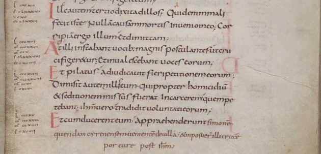
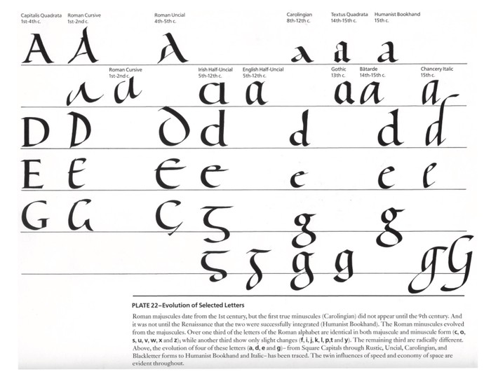
The double-story “g”—what is now the common printed form—is the original form of the lowercase “g” (the OG ... ?), says Paul Shaw, a type designer who teaches at the New School. It originated in the eighth century among monks copying religious texts in Latin. The script they used became known as Carolingian script.
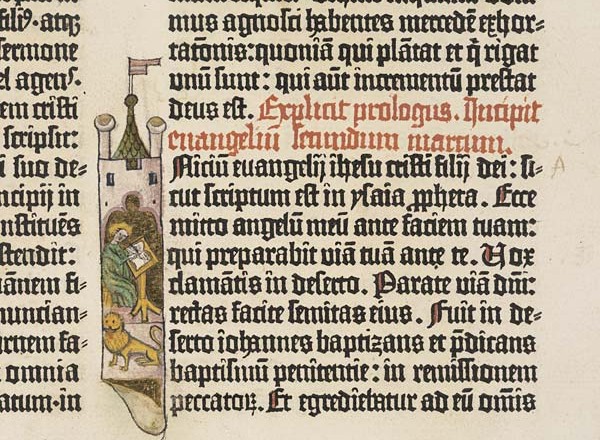
Over time, monks copying by hand introduced variations in their letters. And so, the single-story “g” emerged, most famously in black-letter or Gothic calligraphy. When Johannes Gutenberg started printing books in the mid-15th century, he naturally copied the monks’ Gothic script. The lowercase “g”s of the Gutenberg Bible resemble a single-story “g,” as do the lowercase “g”s of modern Gothic typefaces that imitate this style.
.jpg)
Then, plot twist: the return of the double-story “g.” “In the Renaissance,” says Shaw, “there was an interest in Roman and Greek culture by scholars that led to a revival of the Carolingian script.” Like Gutenberg, later Renaissance type cutters also imitated local scripts, and the Carolingian double-story “g” eventually became popular in print all over Europe. But single-story “g” prevails in handwriting, probably due to how much easier and quicker it is to write.
(The lowercase “a” also has distinct written and printed forms, though the Hopkins researchers found that people were much better at recognizing the printed double-story “a” than “g,” for some reason.)
Today, type designers can play with all the different forms of “g,” single-story or double-story. “I do hope type designers aren’t going to take too much notice of this study, and produce type with single-story “g”s from now on!” says Sara Chapman, a typographer who likes the letter “g” so much she wrote her dissertation on its history and named her studio “Letter ‘g.’” The double-story “g,” she adds, is “often the letter that contributes most to the personality of the typeface.” The fact people are so bad at recognizing the proper shape of the double-story “g” actually gives type designers the freedom to experiment with its shape.
Take the old Google logo, whose double-story “g” flashed countless times before our eyes between 1999 and 2015. So distinct is this “g” that Google chose the lowercase rather than uppercase letter for its longtime favicon—the little icon that appears in your browser tab. But, look closely. This is a weird double-story “g.” The neck connecting the upper and lower loops is too far to the right.
“Their version of that “g” is, in my experience, close to being wrong,” says McCloskey. “We have looked at the “g” in a hundred different fonts. That Google one is a real outlier.”

I called up Ruth Kedar, the designer who created the Google logo in 1999. “The font was chosen in many ways because of that very unusual ‘g,’” she confessed. (The font is Catull.) “This was the ’90s,” she said. “The internet was new, and the people did not really know how to use those things, computers.” Kedar wanted the logo to appear friendly but still convey an old-fashioned authority. This unusual yet familiar double-story “g” helped.
In 2015, with computers firmly entrenched in our lives, Google updated its logo to feature a more modern-looking sans-serif font and a single-story “g.” But when McCloskey’s team recently asked people to pick the correct double-story “g,” the Google logo came up again. “We have had a few people try to offer that as an excuse for picking the wrong ‘g,’” he says.