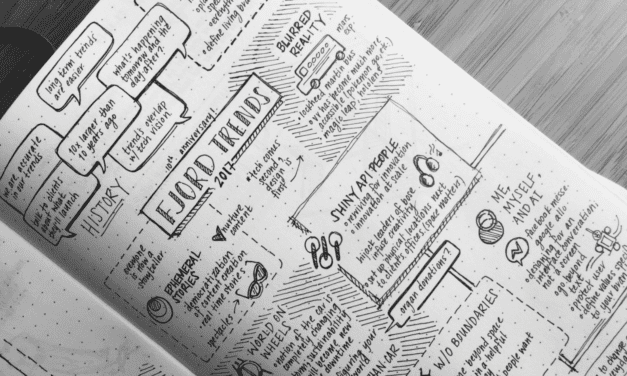
The pen is mightier than the laptop
Ditch the computer and break out the paper for more effective, interesting, and visually stimulating note-taking.
Read More
Ditch the computer and break out the paper for more effective, interesting, and visually stimulating note-taking.
Read More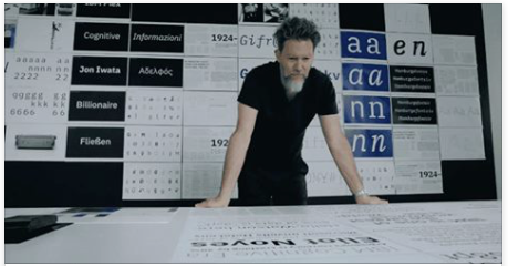
IBM is no stranger to icons. Over the years, it’s created quite a few: the mainframe computer, the ThinkPad laptop, the Selectric typewriter, the Eye-Bee-M logo
Read More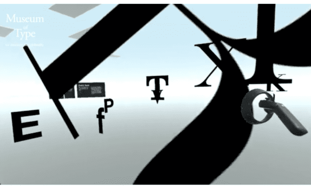
Last year, with my love of typography, I have explored spatial text layout in the physical space and introduced two apps for HoloLens.
Read More
When a company announces a rebrand, the design world sits in eager anticipation. Why? Because we know a rebrand isn’t simply a shiny new logo.
Read More
Personally, I never want to be the only one in the room who doesn’t know what’s new and different in our industry.
Read More