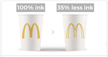
Web fonts: when you need them, when you don’t
I’m not a fan of sweeping statements like you “should” or “shouldn’t” use web fonts, but I think there should be some sort of guidelines to help people decide whether or not to use them.
Read MorePosted by Joe Senior | Sep 8, 2017 | Design, Resource, Typography, Web Design |
I’m not a fan of sweeping statements like you “should” or “shouldn’t” use web fonts, but I think there should be some sort of guidelines to help people decide whether or not to use them.
Read MorePosted by Joe Senior | Aug 29, 2017 | History, Photography, Uncategorized |
Carleton Watkins was born in 1829 in New York, and upon moving to California, Yosemite became his most favorite subject. Believe it or not, it was thanks to his work and his love for Yosemite that this area was preserved.
Read MorePosted by Joe Senior | Aug 28, 2017 | Design, History, Tech |
Posted by Joe Senior | Aug 25, 2017 | Design, Print, Typography, User Interface and Experience Design |
The typometer is an object as fascinating as it is mundane. To the unacquainted eye, it is an inconsequential sheet of plastic, with edges bearing some resemblance to a ruler.
Read MorePosted by Joe Senior | Aug 23, 2017 | Design, Typography, User Interface and Experience Design |
Great content is meaningless if not presented well. Today so much of web designs compromises of text and hitting the right mark for your typography is a key factor in the overall success of your site.
Read More