ARTICLE SUMMARY: We know designing for accessibility is good for business. By making your products and services accessible, you open them up to a significant portion of the population—more than 1 billion people globally live with some form of disability. This represents a largely untapped market.
Many accessibility best practices, like using proper headings, alternative text for images, and descriptive link text, are also good for SEO. This means that accessible websites tend to rank higher in search engines, driving more traffic and visibility.
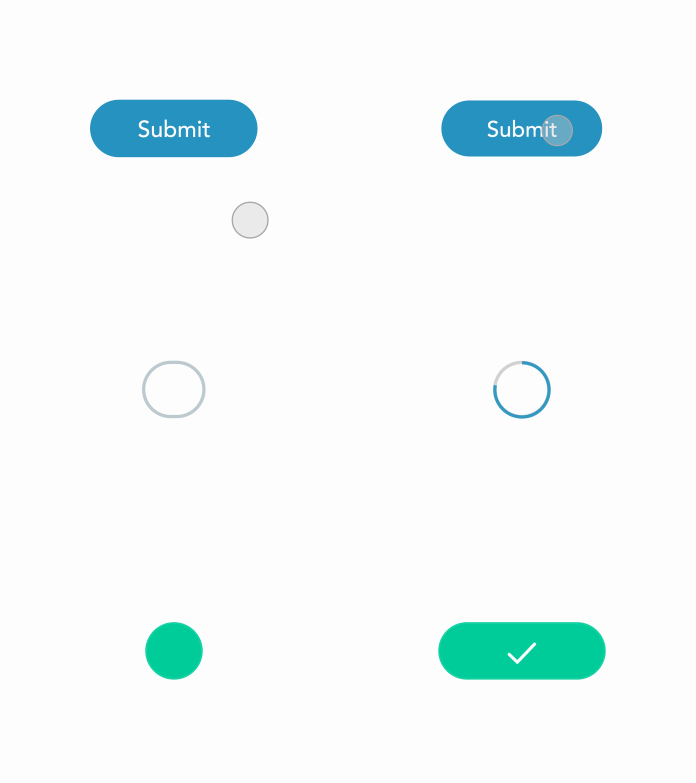
In “14 Rules to Design Accessible Buttons” by Saadia Minhas looks at one of one of the more important aspects of designing for accessibility, “buttons”. To help users interact effortlessly with your interface a few of Saadia’s suggestions include
- Make buttons look like buttons
- Differentiate buttons and links
- Avoid icon-only buttons, use labels with icons where possible
These design principles often align with future technology trends, such as voice interfaces, AI assistants, or augmented reality. Designing with accessibility in mind makes it easier to adapt products to new technologies and platforms. Also, building accessibility into the design phase prevents the need for costly retrofitting or redevelopment later, saving time and resources.
Saadia concludes the article by telling designers “always make your button design accessible ensuring that every user regardless of their abilities can interact effortlessly with your interface. By applying the given rules, you can improve the usability of your product and make it more inclusive and user-friendly.”
This is a great article with a lot of helpful information. Let us know what you think in the comments.


