
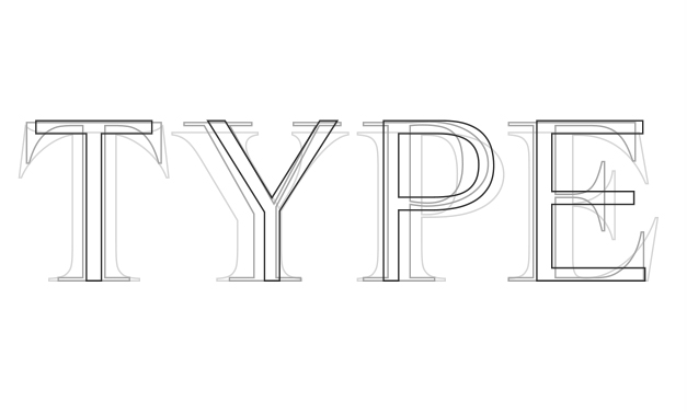
In this article from the Elegant Themes, John Hughes does a great job of identifying and illustrating basic typographic terminology that every designer should know. We want to point out that this is an excellent resource for anyone who works with a designer, to learn and understand some relevant vocabulary and concepts to make working with designers easier and more effective.
Designers often receive critique and recommendations such as “fill up the space” or “make the font bigger”. This kind of feedback can often cause more problems than it solves, such as poor hierarchy and organization, poor legibility due to bad typographic color, and an overall unprofessional or clumsy look. Understanding that adjustments to the weight of a font or the typographic color of a section of body copy are often better solutions to legibility problems, will help reach the best solution. Understanding why your designer may push back on certain kinds of recommendations can help clients better communicate their needs and get the best results from the designers they work with.
Knowing and understanding typographic terms can only enhance your ability to work successfully with designers and get their best work from them for your project. Hughes’ article is a quick visual reference worth looking through to pick up a few of these basic terms and ideas.
You can read the article here:
https://www.elegantthemes.com/blog/resources/typography-terms-every-web-designer-should-know
If you’re feeling a little more ambitious “A Type Primer” by Jon Kane is an easy read that will expand upon these terms and more. He does a good job of providing a deeper look at type classifications and their histories that are essential to understanding the personalities of different typefaces and the aesthetic values that they carry.
If you are feeling really ambitious, “Elements of Typographic Style” by Robert Bringhurst is regarded by many as the type grammar bible. It isn’t light reading but you will have a deep understanding and appreciation for the level of understanding and consideration your designer should be applying for each project they work on.
If you think some terms were left out that would be beneficial and should have been included let us know in comments.


