ARTICLE SUMMARY: Nothing holds a potential client like an attractive and user friendly website.
When it comes to websites first impressions are everything. Without a good design your target audience has no problem moving on to the next site faster than a speeding bullet.
One of the ways to entice your visitors to stay longer is using “white spade” to create a clean, crisp and responsive website that will hold their attention.
“Clean UI Guide: 15 White Space Design Tips” will help you understand and teach you how to use “white space” in your design. Some of the tips you will be looking at are
- Product isolation
- Establishing a relationship between elements
- Simplifying the page structure
Designing with white space in mind is more than having a lot of room around our elements, it takes a lot of forethought and planning to keep perspective clients from moving on.
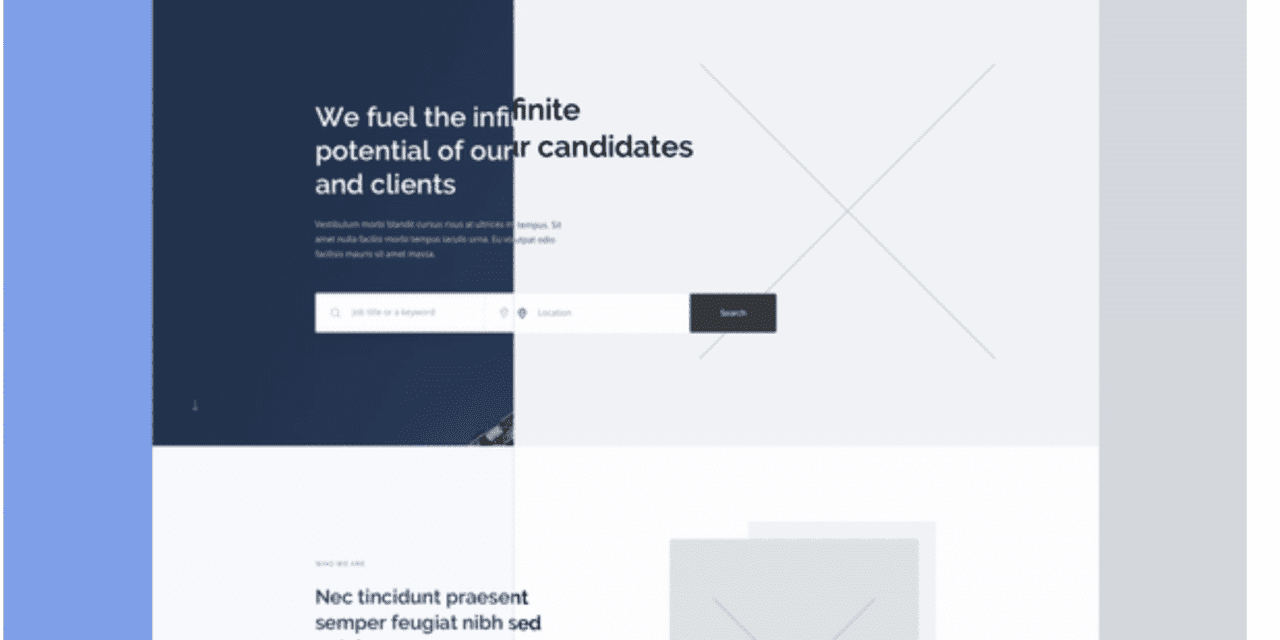
When done right white space will balance the rest of the design, highlighting what is on the page. White space helps to focus the visual attention of the user.
There is a lot to learn from this article along with a good amount of examples to give you a visual understanding of what the final product should look like.
Let us know what you think in the comments.


