
ARTICLE SUMMARY: Designers know that color done right sells, especially when designed with accessibility in mind. Color is the first thing users see and it sets the tone for their entire user experience. Saying color is important is an understatement.
In this age of Inclusivity color can be a challenge, especially to the beginner UX designer. Challenges like low vision, color blindness must be addressed in order to help your project succeed on a higher level.
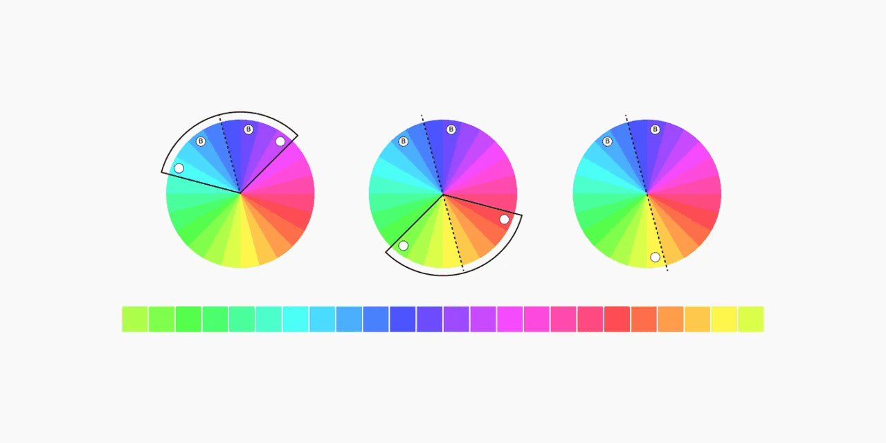
“UI color systems that work: a designer’s guide to palettes, contrast & harmony” by Bess W. uses her personal experience to help you create your own UI color system that works. She talks about:
- Understanding color accessibility (WCAG)
- Developing neutral gray steps
- Creating a hue palette using brand colors
When done right, color guides user attention, establishes visual hierarchy, and reinforces brand identity. It also helps users navigate interfaces more intuitively giving them a greater user experience. The better the experience the more it will evoke emotional responses that influence perception, engagement, and overall user satisfaction.
If you’re a seasoned designer or just starting out, this article is for you. Let us know what you think in the comments.


