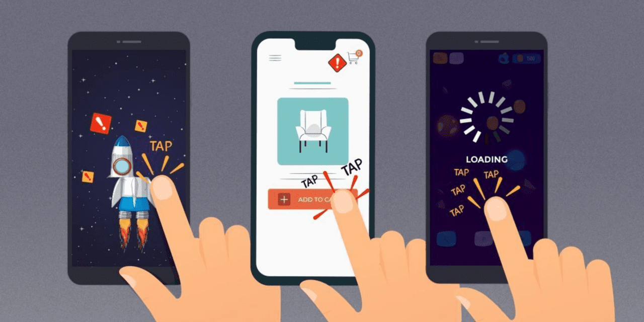
ARTICLE SUMMARY: Rage tapping, it’s annoying, frustrating and I’m pretty sure there have been a few occasions where you have given your smart phone flying lessons.
Whether it’s a slow website, or you have to tap a button two or three times to move on and you missed on the third tap for the third time you wonder what kept your finger from penetrating your smart phone.
Vitaly Friedman may have the answer to your problem. His article “Accessible Target Sizes Cheatsheet” takes a look at the sizes of the buttons, keys, links and icons people are having problems with. He looks at
- When Multiple Taps Are Better Than One
- Provide An Assistant For Complex Manipulations
- Always Maximize Clickable Area
It’s hard enough getting perspective clients to your website and holding their attention. The last thing you want is to drive them away because they are having navigation issues with your website on their mobile devices that could have been designed a little better.
When it comes to mobile navigation this article will help you avoid causing rage taps and angry clicks by potential clients and web surfers, well worth the read.
Let us know what you think in the comments.


