
ARTICLE SUMMARY: As designers, we understand how crucial typography is to the success of any project. For users, it’s simple: they can either read it or they can’t and have no interest in why.
Most people aren’t aware of the depth of research and thought that goes into type and how significantly it impacts their user experience.
In “How to be strategic when picking a typeface” Bess W. draws from her typography research to guide you through a thoughtful, step-by-step process for selecting the right type for your design. She explores key factors such as
- Top-to-bottom leading ratio
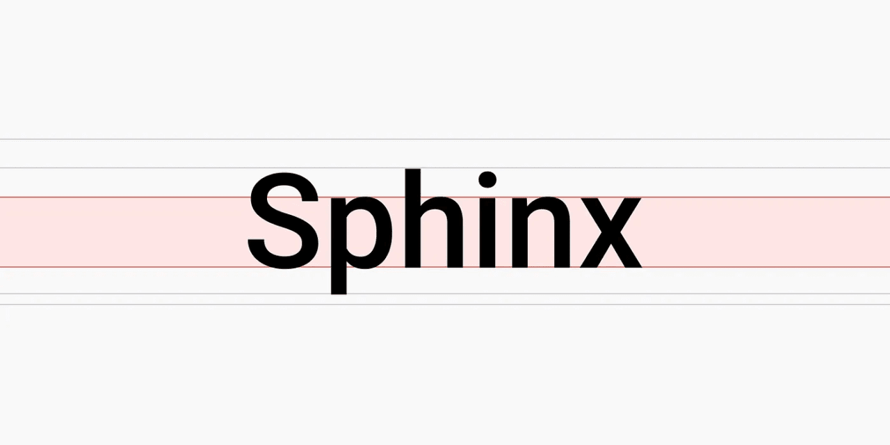
- x-height ratio
- Spatial Efficiency
She also explains that using monospaced numbers, each with the same width helps ensure clean alignment in tables, forms, and dashboards, which improves readability and makes data easier to compare. Also recommended are shorter numeral lengths to help maximize space by fitting more digits in the same horizontal area, especially useful in dense layouts like dashboards, tables, and mobile views.
Bess also discusses multilingual support, noting that not all fonts handle every script. Before picking a typeface, she recommends checking which languages your product needs and using tools like charset checker to ensure compatibility.
This article offers valuable insights for both new and experienced designers. Let us hear your thoughts in the comments.


