
ARTICLE SUMMARY: Color is one of the most taken for granted things on the face of the earth. It’s there 24/7, surrounding us and influencing us and the actions we take. A good designer will use the power of color to manipulate us into seeing more than just color, we’ll see the story they are trying to tell.
As designers we know the use of color will enhance any story we are going to tell. When used correctly colors will tell a story without words guiding the audience’s emotional journey and engagement with the design.
“How to create a color story” by James Buckhouse is an in depth look at the use of color through his personal experience and how to create a color system that will help you tell your story. Some of his talking points include
- Color Story as Strategy
- Color story for apps and startups
- Language as data
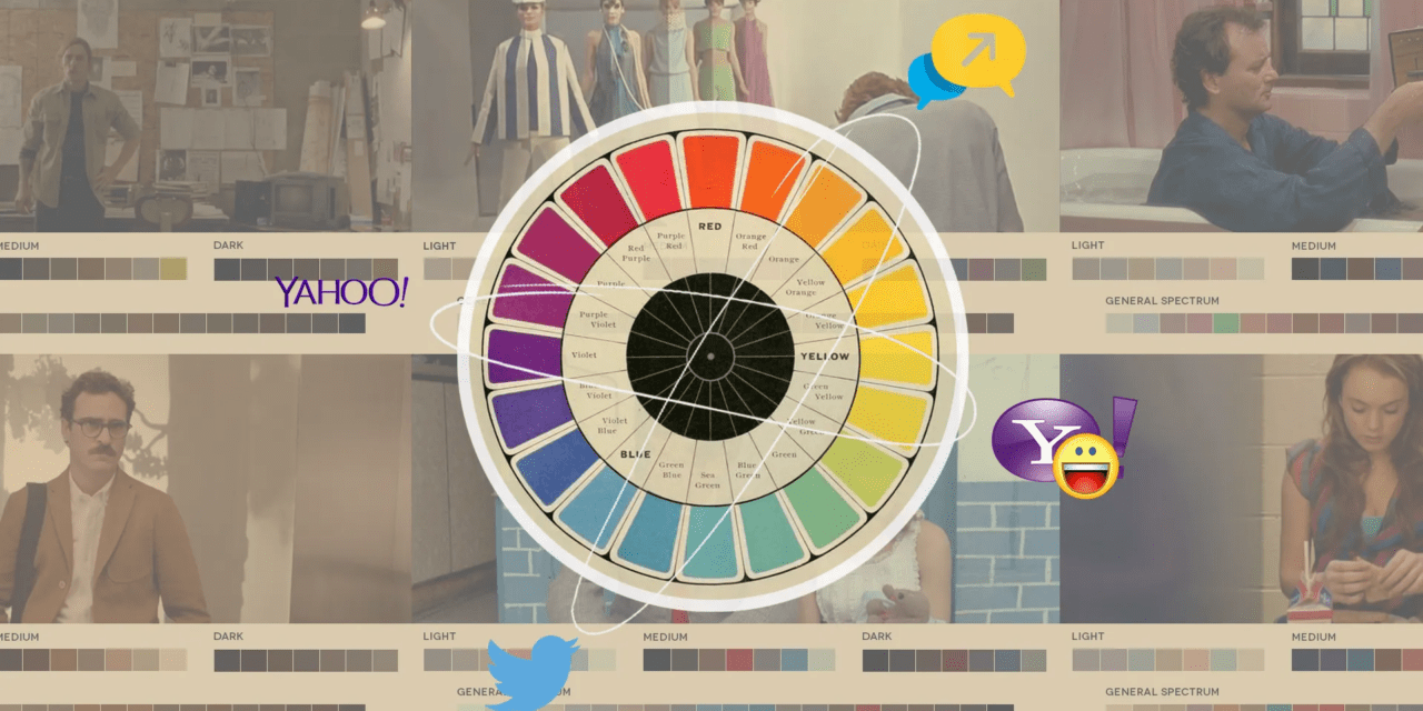
A color story is essentially a cohesive collection of colors that work together to convey a particular mood, theme, or concept. A well-planned color story ensures consistency across different elements of a project, whether it’s a brand, a collection, or a design. This consistency helps to create a unified look that is easily recognizable.
A cohesive color story ensures that all the elements in a design complement each other resulting in a visually appealing and harmonious composition. It allows the designer to balance bold and neutral colors, ensuring that the design isn’t overwhelming or chaotic but rather well-balanced and pleasing to the eye.
You can never know enough about color. This is a very informative article well worth reading.
Let us know what you think in the comments.


