
ARTICLE SUMMARY: There’s an old saying we heard growing up: the more you learn, the more you earn. In design, that’s a fundamental truth not to be ignored.
Designers know that two of the most powerful forces in design are typography and color. Our choices on these can make the difference between a seamless, satisfying experience or frustration and exclusion. That’s why mastering them is essential to effective design.
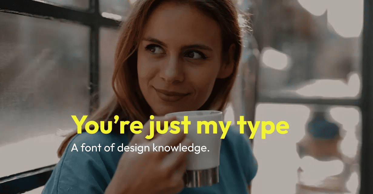
Andrew Tipp’s “UI Design: Typography and Colour Fundamentals” is a comprehensive guide for these two powerful forces. This article moves from the basics to practical application in your digital products. He dives into:
- Why is typography important in design?
- Why is colour important in design?
- Typography and colour in practice
In design, the right typeface and color support your brand’s voice. Clear, legible typography allows users to quickly and easily learn about your products and services they might want or need. If they can’t access or read that information easily, they’ll turn to a competitor — or give up altogether. Using recognizable fonts and consistent colors help users interact with your company while reinforcing consistency, trust and brand loyalty.
The importance of color cannot be understated, it shapes how users feel, understand and navigate a product — often long before users read a single word. It creates a visual hierarchy directing the user to what’s clickable, what’s most important and where to look next. Color is not just aesthetic, it’s functional, and each choice evokes a distinct emotional response.
For you beginning, designers this article is a must read with a lot of useful information. For seasoned designers, it’ serves it’s a valuable refresher. Either way, it’s a valuable resource that belongs on the top shelf of your design toolbox.


