ARTICLE SUMMARY: It’s interesting when you look back to when you first started in design and how basically between school and some experience you pretty much ready to conquer the design world. Maybe you thought there was nothing you could do to improve on the early designs you created, they were perfect or close to perfect as possible.
Fast forward and after a few years in the trenches you decide to take a look back out of curiosity to see how good you really were back then. It’s good to look back at past projects. Comparing your designs from when you first started to where you are now is an invaluable practice to help you keep moving forward.
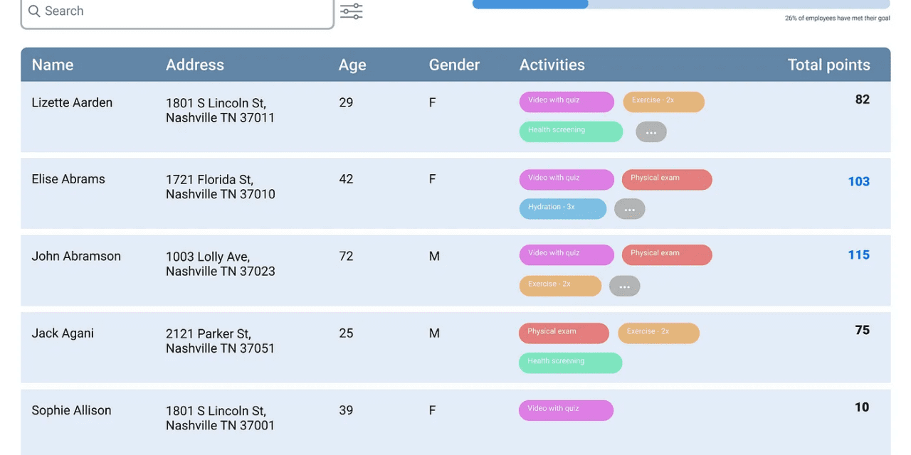
In Annie Worford’s “UX Design Challenge: Then and Now” she looks back at a project done three years earlier and evaluates what she had done then and compares it to what she would do now. A few of the key things that she would change would be the
- Text
- Color
- Components
Comparing your designs from when you first started to where you are now is an invaluable practice that helps you track your skill development and identify your strengths and weaknesses. Your liable to find your thought process, from research to execution, is likely more user-centered, strategic, and nuanced.
Annie Worford’s final advice to designers is “If you’re only going to take one piece of advice from this article, let it be this one. Look at other tables–and not just on dribble, but in real, functioning interfaces. For some reason, when I started out designing, I assumed that looking at similar designs was cheating. But like my art teacher drilled into my head in college, you have to draw what you see, not what you think you see.”
It is always good to look back and self evaluate and see how far you have come and how far you have to go to get where you want to be. This is an article well worth reading.
Let us know what you think in the comments.
