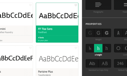
ARICLE SUMMARY: When searching for anything, whether it’s Netflix or a website and you have to many decisions to make in a short amount of time you run the risk of getting Decision Fatigue causing you to make poorer choices.
When designing websites the last thing you want when someone is shopping on your website is for them to develop Decision Fatigue. You want people focused on your product or service, you want your visitors to have a smooth and easy experience.
“6 WAYS TO REDUCE COGNITIVE DEMAND WHEN DESIGNING UX” by Alexander Rådahl is a common sense approach on how to avoid giving visitors to your website Decision Fatigue, some of the suggestions are
- Reduce the number of choices users have to make
- Make it easy to get back on track if you make a mistake
- Use visual clues for navigation
Keeping customer focus on your products and services is the main goal here and these steps will help you achieve that goal. In conclusion Alexander Rådahl says “Decision Fatigue is a popular term used to describe when people have made too many decisions over a specific period. Research suggests that it mainly occurs as humans’ cognitive resources diminish with time. Decision fatigue can happen when there are too many choices to consider or when the decisions being made seem inconsequential and don’t warrant any attention.
Let us know what you think in the comments.


