ARTICLE SUMMARY: For the most part the average person reading something really doesn’t know a thing about typography or the influence it can have on them.
What they do know is that aesthetically they either like it or they don’t and probably have no clue why that is.
As designers it is our job to make sure they have the best reading experience possible. The people reading our work don’t need to know about fonts or points and picas, kerning and leading. But we do.
Marc Andrew put together “7 powerful tips to help improve your Typography skills (Updated)” to help you give the visitors to your site the best reading experience possible. A few of those tips are
- To improve the optical balance of your headings, reduce the letter spacing.
- Make sure your Headlines and Body Text have the perfect vertical rhythm.
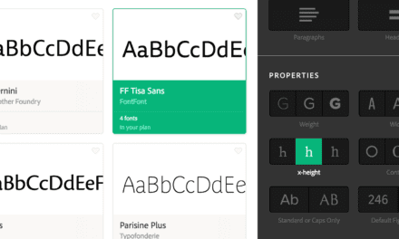
- When looking for a multi-purpose typeface, choose one that comes in a variety of weights and styles.
With the fierce competition in the global marketplace designers need to do all they can to keep and hold the visitors to our websites in an effort to get them interested in our product or service and typography is a major part of that effort.
Marc Andrew finishes off his article by saying “With this short collection of typography tips, I hope you’ve realised how even the tiniest changes to your designs can result in better end-results for you and your users.”
There is a lot of good information to glean from this article. Let us know if this has helped you in the comments.


