
ARTICLE SUMMARY: Truth be told, when it comes to color there is no such thing as too much information.
When dealing with colors you need to take into account different colors can evoke different emotions and convey different meanings to the viewer. There is more psychology dedicated to color than most people realize and we need to take that and use it in attracting and holding our target audiences attention.
One of the questions to ask yourself is do the colors chosen for your brand align with the message you want to convey to your audience, and that’s just the beginning.
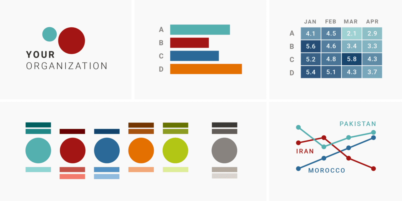
“A detailed guide to colors in data vis style guides” by Lisa Charlotte Muth is a soup to nuts guide to creating a color palette as part of a data vis style guide for your brand. This article covers
- Do you even need a fixed color palette for your data visualizations?
- Four different approaches to organizational color palettes
- Colors for common categories
Colors can emphasis important or key data points and ensure that data points are easily distinguishable from each other.
Color palettes are essential in creating a visual identity for your brand. They play a significant role in conveying your brand’s personality, values, and message to the visitors of your website.
Remember that the goal of your color style guide is to enhance the clarity, understanding, and impact of your data visualizations. It’s important to strike a balance between aesthetics and functionality to create visuals that effectively convey your data’s insights to your target audience.
This is a great article and resource for new and seasoned designers alike.
Let us know what you think in the comments.


