ARTICLE SUMMARY: There is a lot of information out there that people are interested in or have a need to know.
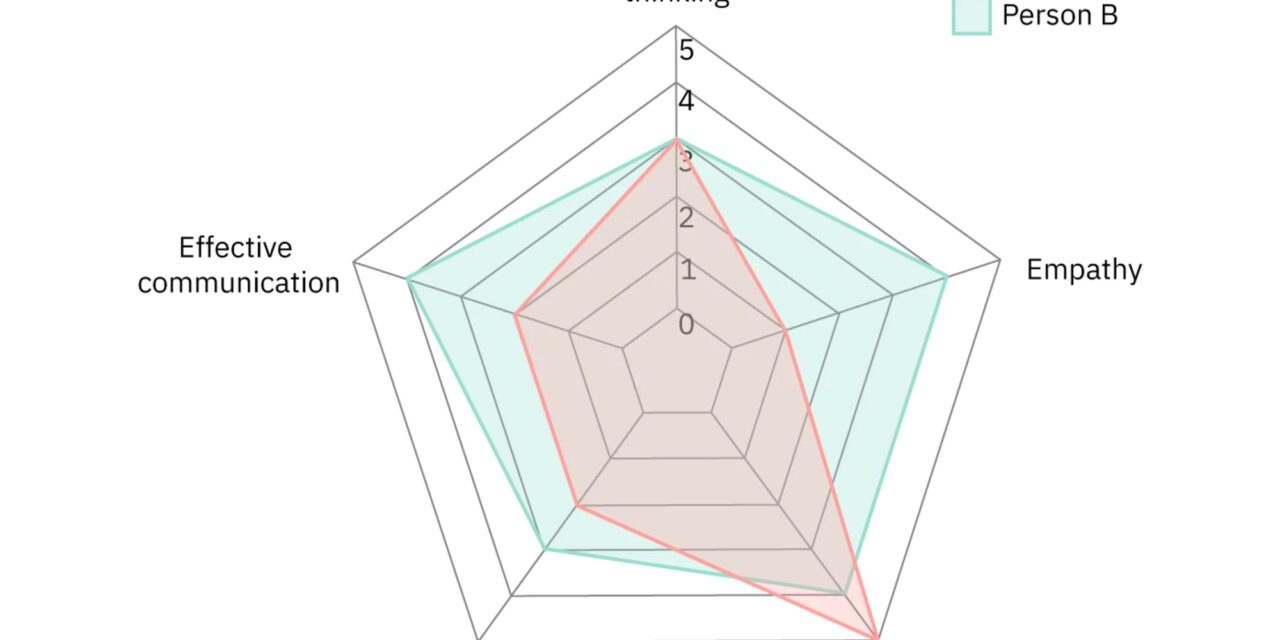
The problem is how to present that information in a clear and concise manner without loosing your target audience. Do I use a pie chart, bar graph or some other method to get that information out.
“A Guide To Getting Data Visualization Right” by Sara Dholakia can help you pick the best way possible to present your information to your target audience. Some of the topics she covers are
- How To Choose The Right Chart Type
- What Message Am I Trying To Communicate With The Data?
- What Is The Purpose Of The Data Visualization?
With everyone having a computer and access to unlimited information you need to know your audience and the most strategic way to give them the information they need or want.
What better way to give that information than to use Data Visualization. One chart or bar graph can be worth a thousand words, the trick is using the right visual aid.
Sara Dholakia will help you pick the appropriate visual for the appropriate audience.
This article is well worth reading for new and seasoned designers alike.
Let us know what you think in the comments.


