
ARTICLE SUMMARY: We designers know the importance of color. You know that whether it’s driving down the highway or thumbing through a magazine at the doctor’s office you’re gonna notice the color billboard, headlines or photo first, article second.
We also know that it doesn’t matter what kind of work you do in life, sometimes it’s good to go back to the basics and review. You never know when you might pickup some golden nugget you missed the first time around or realized you’ve forgotten something important that could have enhanced your last or future designs.
“Basic Color Theory” is just that, and while it’s great for beginner designers to read this article there are some of us oldsters who could use a refresher. This article looks at
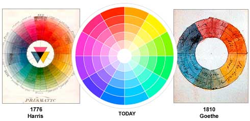
- The Color Wheel
- Color Harmony
- Color Context
Understanding color theory is fundamental to creating effective and aesthetically pleasing designs. Basic principles like color wheel, color harmony, and the psychological effects of colors form the backbone of good design.
Going back to the basics can spark new ideas and approaches. It can remind you of techniques or combinations you might have overlooked, leading to more innovative and effective designs.
Design trends evolve, but the principles of color theory remain constant. Revisiting these basics can help you adapt trends to fit within the timeless principles of good design and help ensure your designs remain effective, innovative, and aligned with best design practices.
This is a great article well worth reading. Let us know what you think in the comments.


