ARTICLE SUMMERY: When designing for mobile apps there are a lot of things to remember, at the top of the list is typography.
In his article “Guide for designing better mobile apps typography” Andrey Zhulidin will discuss the type aspects you should be aware of, such as,
- Minimum Font size
- Headline size
- Contrast
along with recommendations using the guidelines from companies such as Apple, Google and Android.
Other take aways Andrey Zhulidin discusses
- System Fonts
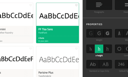
- Commercial Fonts
- Free Fonts
- Use of Whitespace and margins
In this article there are many visual examples of how your mobile app should and should not look.
If your new to mobile app design or just need to brush up on the guidelines, this article is a great resource for you
Please share your thoughts in the comment section.


