
ARTICLE SUMMARY: Choosing colors for a brand is a crucial aspect of brand design. The goal is to create a color ramp for a design system that will establish a set of related colors that can be consistently applied across various elements of a product or brand.
Colors can convey emotions, set the tone for the brand, and create a cohesive visual identity across various products and platforms.
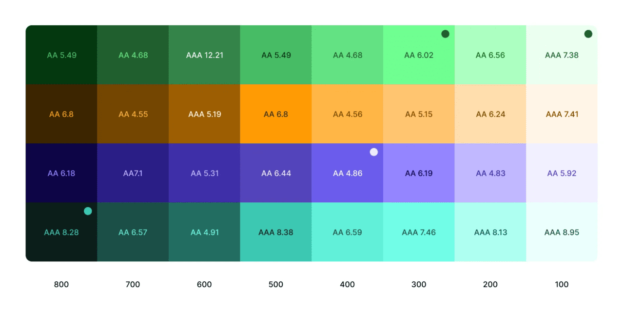
“How to create a color ramp used in design systems” by Katie Cooper takes the time to give you step by step instruction on how to build a successful color ramp. Some of those steps are
- Start with defined brand colors
- Adjust for lightness at each step
- Check contrast ratios for accessibility
A well-designed color ramp enhances visual consistency and user experience across various products and platforms. It’s an integral part of a comprehensive design system that facilitates efficient and cohesive design workflows.
Remember that the color palette is just one aspect of brand design. It should work harmoniously with other elements such as typography, imagery, and messaging to create a cohesive and memorable brand experience.
This is a great article for young and old designers.
Let us know what you think in the comments.


