ARTICLE SUMMARY: In the printing industry the rule of thumb is to standardize whenever possible. Keep it simple, keep it consistent, keep it so everyone sees at a glance and knows what they are looking at,.
Same holds true for design, except when you design you want your website and email to look consistent, to be remembered and recognized at a glance.
In Paul Airy‘s article “HOW TO CREATE ONLINE BRAND CONSISTENCY (FOR EMAIL AND WEB)” he give us instruction on how to design for brand consistency and what we should be paying attention to while designing for that consistency. Some of the items he discusses are
- Logos
- Colors We Use
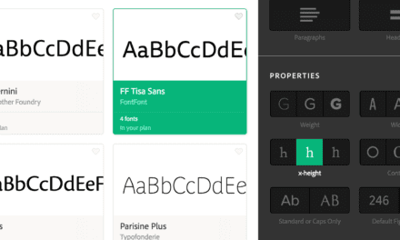
- What Fonts We Use
The above is just the beginning, Paul Airy gives us an in-depth breakdown on how to formulate an email design and development strategy. Also helpful, for the beginner he provides links so they better understand how to design for this consistency.
As Paul Airy says “Brand consistency leads to brand recognition, and brand recognition leads to brand trust.” This article is well worth reading.
Let us know what you think in the comments.


