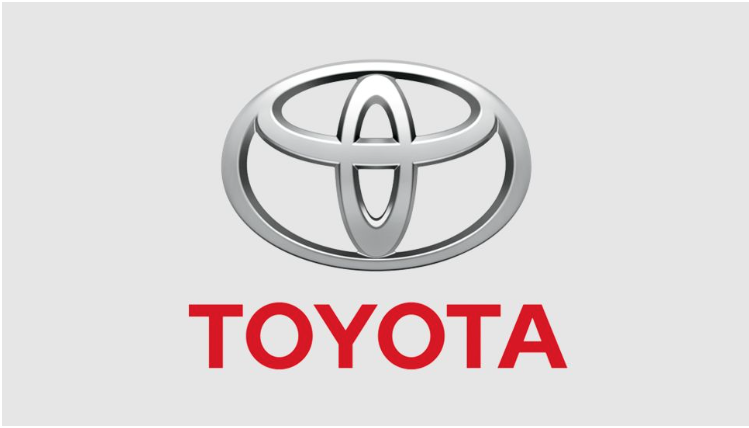
ARICTLE SUMMERY: “Is Toyota’s logo cleverer than it looks?” is a look at one of the most iconic car logos of today.
As Daniel Piper points out many logos have hidden messages, some more obvious than others, some you need to stare at it like a 3D picture puzzle trying to find the picture in the picture.
Whether intentional or accidental, with a little imagination it’s easy to see the spelling of ‘TOYOTA” in the logo.
It’s a short, interesting read with with links to useful articles on and about logos. Designers are more than clever problem solvers, they tend to make people think outside the box. Maybe you see something in a logo that others have missed, let us know what you think in the comments.


