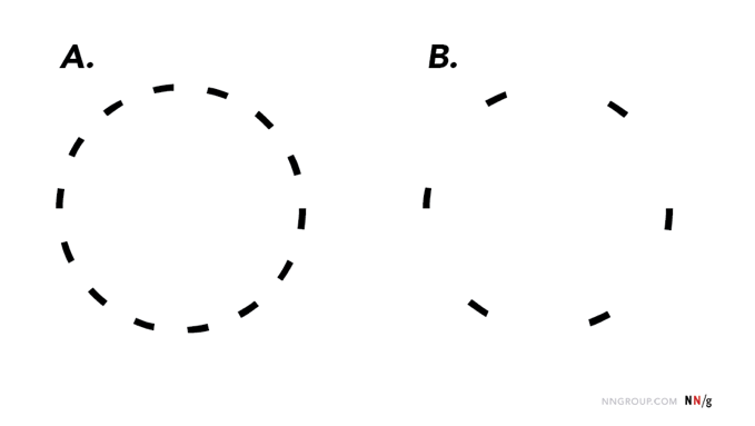
ARTICLE SUMMARY: The human mind is an amazing thing. Visually we like things organized and complete. Enter Gestalt and the “PRINCIPLE OF CLOSURE” in design.
“PRINCIPLE OF CLOSURE IN VISUAL DESIGN” by Alita Joyce gives a good look into this principle and how it is used in design and it’s influence on the people who see it. She helps us understand it’s
- Applications
- How to Apply the Principle of Closure to Signal Additional Content
- Ensure that Segmented Elements Communicate the Whole
And while the “PRINCIPLE OF CLOSURE” is not difficult to understand, using it in design will take a little forethought and planning, but, when done right this principle will give your design an innovative and eye catching look a designer aims for.
As .Alita Joyce says “When presented with incomplete objects and information, humans have a tendency to fill in the blanks. As designers, we can apply the principle of closure to simplify visual elements and communicate (and encourage interaction with) additional information.”
This is an interesting article well worth reading, let us know what you think in the comments.


