ARTICLE SUMMARY: As designers we know when it comes to branding that type and font pairing is one of the most important, if not the most important element in our designs. It is our chief tool to use for whatever message we are trying to communicate to our target audience. When font pairing is done right not only will it help get your message read but it will add beauty and value to whatever you’re creating. Font pairing done wrong can distract the user from whatever message you are trying to communicate and cause an early exit from your website.
Most websites use more than one type font, “THE STEP-BY-STEP GUIDE FOR PAIRING FONTS” written by Erik D. Kennedy is a guide to help you confidently pair up type fonts and enhancing your design. There is a lot to consider when pairing fonts
- Determine your brand (because brand drives typography)
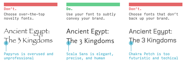
- Brainstorm fonts that subtly convey your brand
- Add an additional font to fill out another aspect of the brand
As more and more people are creating websites it is critical for the professional designer to master the art of font pairing in an effort to have our brand stand out and hold our target audiences attention in today’s global marketplace.
As Erik D. Kennedy says, “If you google for how to pair fonts, you’re going to get a lot of awful results. A first-page result recommends pairings no experienced designer would touch with a 10-foot pole.” By putting this guide together for us he is saving you the time and trouble it takes to find out what really does and does not work.
This is a great resource to have handy. Let us know what you think in the comments.


