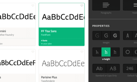
ARTICLE SUMMERY: Typography can make or break a website, It’s that important that we spend the time to learn and to understand how to use typography to enhance our, or our clients message. Lexie Lu has taken the time to help us understand this part of typography and why it is important to us designers.
In her article, “THE TIME AND PLACE TO USE SERIF AND SANS SERIF” she discusses when we should use Sans or Sans Serif and also talks about why, things like,
- Why Sans Serif fonts handle reduction better
- Why Serif fonts like contrasting colors
- Why most body text on websites are Sans Serif
This is just a small part of the article and well worth you taking the time to read Lexie Lu‘s clarification for the use of Sans or Sans Serif. Along with her visual examples it makes this a must read for any design beginner and a refresher for the seasoned designer as well.
Let us know what you think in the comments.


