ARTICLE SUMMARY: A brief history, Icons are known to have been produced from the 3rd century CE and to have become popular from the 6th century CE. Xerox is credited with developing the first GUI (graphical user interface) in the early 1970s and their popularity keeps growing.
We love icons, designers, clients, visitors to our websites, we all love what they do. In this fast paced world they convey a lot of information and direction in a small amount of time.
As designers we know when it comes to creating icons there is more there than meets the eye, there needs to be a lot of forethought and planning in order to create icons that are effective.
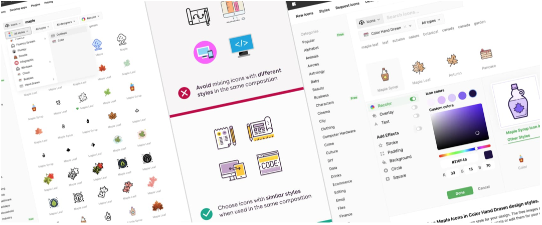
The good news is Stéphanie Walter has written “TIPS ON HOW TO PICK THE RIGHT ICONS FOR YOUR WEBSITE“, giving us detailed insight and instruction on how to design effective icons that will enhance your website user experience and interface. Some of the topics include
- What should you consider when selecting an icon?
- What makes a good consistent icon selection?
- How do you make sure your icons have the same style?
This article covers so much more than what’s listed above, we need to remember the average visitor to your website has no clue what goes into designing an icon, they only know that if it doesn’t look good, or something doesn’t look right, or does not appeal to them aesthetically on some level or there’s any friction they move on to another website in an instant. That’s not good.
For new and seasoned designers alike, this is a great resource to have at your fingertips.
Let us know what you think in the comments.


