
ARTICLE SUMMARY: Buttons are the unsung heroes in design, they turn intent into action. They are the moment of truth, did my design work? Was it good enough to compel the visitors to my site to make the choices I wanted them to, or did I fail.
There are times when a designer spends a lot of time creating something and, for some reason, it just doesn’t look right. Drives you nuts, right?! At that point, maybe it’s time to get a second opinion.
In Mohit’s article, “Why Your Buttons Feel ‘Off’ (Even With Good Colors)” he shares a conversation with a friend about his concerns with his button design. Through that conversation, he picked up a few insights that improved his approach—and now wants to pass them on to other designers, including:
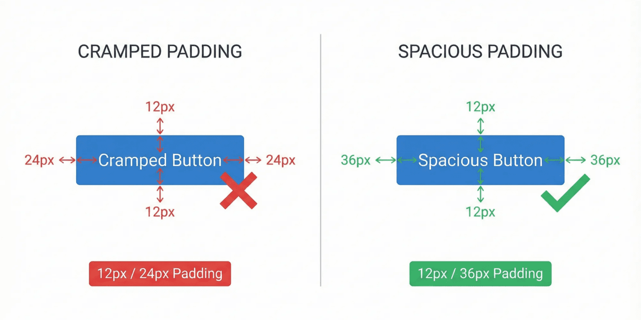
- Your Padding Ratio Is Wrong
- Size Hierarchy Solves the ‘Everything’s Important’ Problem
- What You Write AROUND the Button Matters More Than the Button
Poorly designed buttons can undermine even the best designs. Because they sit at the point of action, it’s critical they be done right the first time. That’s why designers need to pay close attention, nothing signals a poorly designed button faster than a hit to the bottom line.
Mohit reminds us that buttons are important because they are 0.5% of your visual design but handle 100% of your conversions. That’s a lot of influence for a small amount of screen space, so they have to be good.
This article is a great resource that belongs on the top shelf of your design tool box. Let us know what you think in the comments.


