
ARTICLE SUMMERY: There is nothing worse than looking at an icon and thinking to yourself what the heck is that trying to tell me. “7 Principles of Icon Design” is a great article on what it takes to design an icon that communicates a specific idea or an action needed with ease and a minimum of thought.
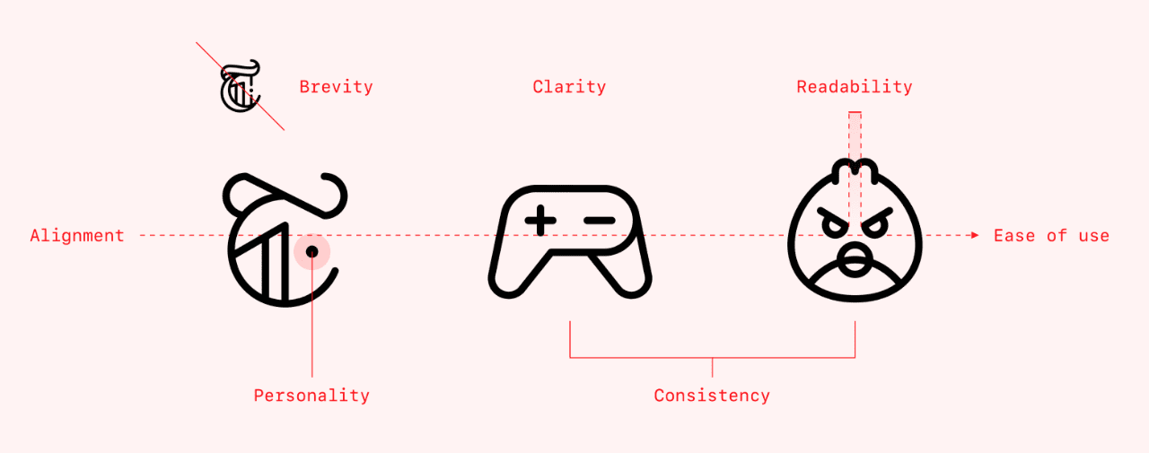
Helena Zhang points out what is needed to make an icon that is simple, easily understood, and above all, communicative,
- Clarity
- Readability
- Brevity
Thats just a start to her list. From the cars we drive to the websites we go to, icons are a part of everyday life more than most people realize. As designers it’s our job to make it easy for people to comprehend the message of the icons we design.
Helena Zhang gives us the 7 principals and the reason to follow these principles to achieve our goal when it comes to designing our icons.
Let us know what you think in the comments.


