
ARTICLE SUMMARY: In the beginning, when it came to shopping online you were limited. In 1995 there were about 23,500 websites compared to the 1.2 billion that are out there today. Talk about to many choices.
The trouble with too many choices is that it makes it easy for users to jump from one site to another, especially if your navigation makes them work too hard to find what they want. And no consumer is going to take the time to tell you your navigation leaves a lot to be desired.
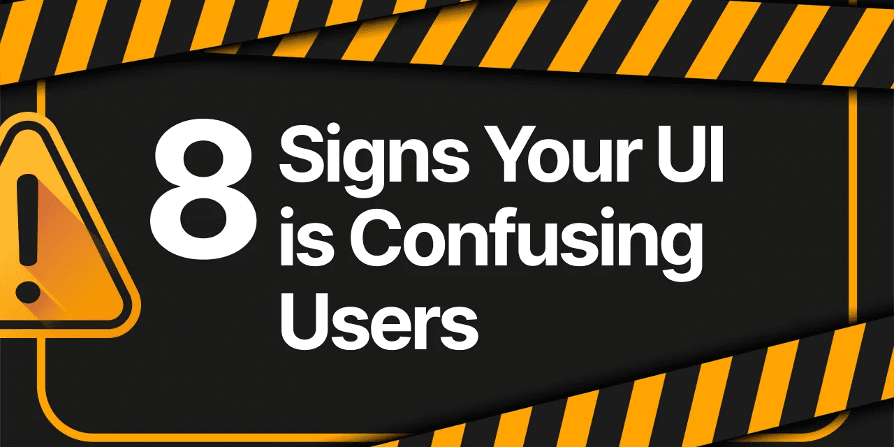
“8 Signs Your UI is Confusing Users” by Ryan Almeida shows designers some of the red flags to watch out for while building your site, things that might be hurting your business. A few of these red flags include:
- Users keep asking, “Where do I click?”
- Your navigation feels like a maze
- Your app requires too much thinking
Designers need to be careful to avoid hiding important content under excessive amounts of text or fancy shapes that do nothing but cause shoppers to scroll right past the very thing you want them to see. Like the old saying goes, less is more.
Half of these problems are caused by the designers assuming the users think like designers. As Ryan says, “Users don’t want to “learn” your app, they want to breeze through it without using brainpower. Clean, predictable, obvious design is what keeps people around.”
There’s a lot of competition out there, an article like this is well worth the read. Let us know what you think in the comments.


