
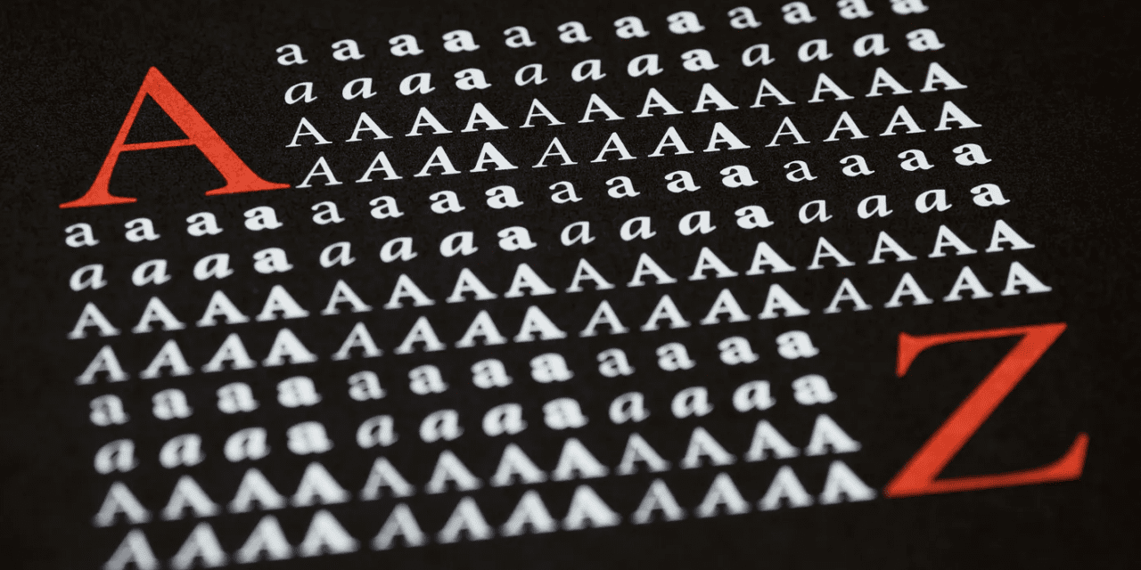
ARTICLE SUMMARY: When it comes to web design nothing is more important than typography, it is key to good communication, maintaining brand identity, convey emotions and set the tone for the content across various communication mediums.
Good typography is essential in web design as it enhances readability, user experience, and overall aesthetics, and when done right contributes significantly to your bottom line.
“9 Rules for Good Typography in Web Design” by Michael Paland gives you a guide to help you use typography effectively and with confidence. Some of his rules include
- Put Readability and Legibility First
- The Power of Breathing Room in White Space
- Accessibility and color scheme
Most people visiting your website do not realize the time and effort that goes into choosing the right typography for a design. They only know that either they like what they see or don’t and move on.
Designers know they have roughly fifteen seconds to grab a visitors attention and hold them before they move on, so we know that typography needs more than just a passing glance if we are going to have a successful website.
These rules should be adapted based on the specific context and purpose of your website. Consistency and clarity are key, and the goal is to create a user-friendly and visually pleasing experience that will hold the attention your target audience.
Let us know what you think in the comments.


