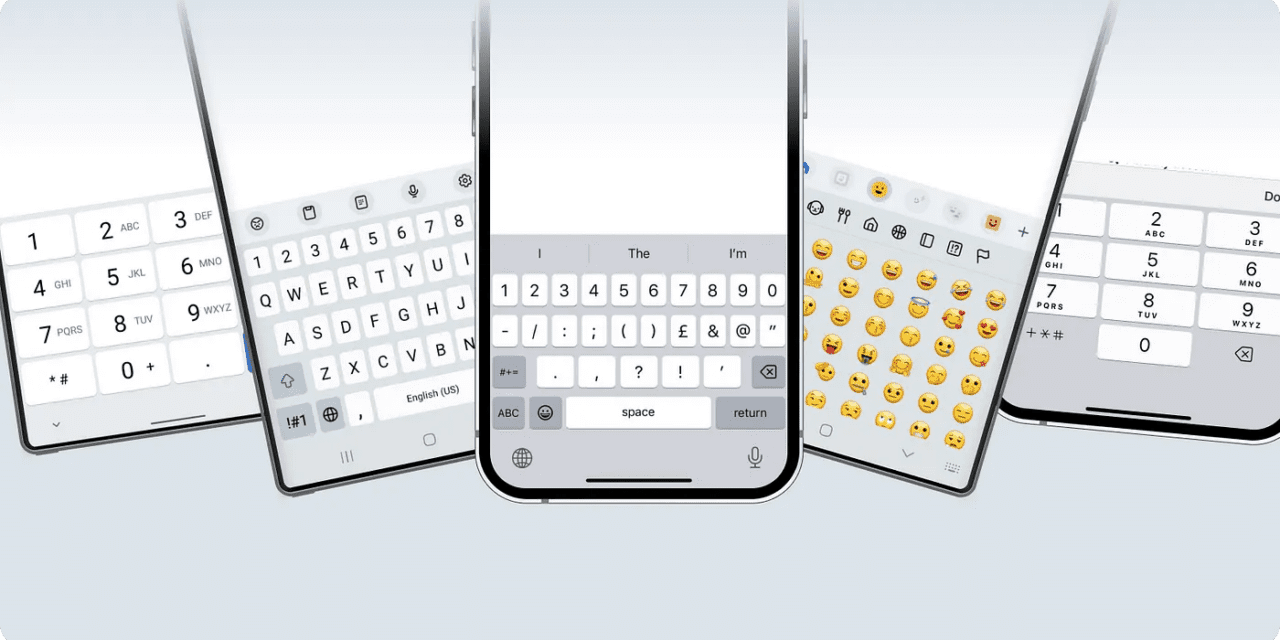
ARTICLE SUMMARY: In this day and age there is a lot to take into account when designing interfaces for mobile applications. More often than not the keyboard is left out of the equation..
Designing with the right keyboard in mind involves considering the target audience and their specific keyboard layouts and usage habits. You need to understand your audience and consider things like accessibility, geographic regions and cross platform compatibility.
“Are you designing with the right keyboard in mind?” by Ksenia Toloknova looks at the why’s and wherefore’s of using the right keyboard for your design. Some of the things we should know are
- What determines the keyboard’s appearance?
- Choice of input field type
- Phone model
If your website is going international you need to ensure that it can be easily localized to different languages and keyboard layouts. Cultural sensitivity is a must, designers need to see how cultural differences may affect the usability of certain key functions or symbols. Nothing should be taken for granted.
By designing with the right keyboard in mind, you create products that are more efficient, user-friendly, accessible, globally relevant, and technically sound. This holistic approach ultimately leads to better user experiences and greater success in the marketplace.
As Ksenia Toloknova says, “Keyboards are smart enough and make users’ lives easier even without the involvement of a designer. However, you can only use all the features if you know about them.”
This is a very informative article, let us know what you think in the comments.


