
ARTICLE SUMMERY: In design the importance of typography and it’s proper use can never be understated. The other side of the coin is the improper use of typography can have a costly effect on your design.
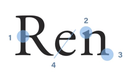
In his article “A GUIDE TO RECOGNISING FONT STYLES” Matej Latin states “When it comes to typography, and especially when it comes to typefaces, it’s all in the details.”, truer words were never spoken.
Matej Latin takes the time to show you the different typefaces within each font style. Good examples of the SERIF FONT STYLES includes:
- Old Style
- Transitional
- Neoclassical & Didone
- Slab
In the SANS-SERIF FONT STYLES Matej Latin includes:
- Grotesque
- Neo Grotesque
- Geometric
- Humanist
Just to name a few.
The other interesting thing in this article is the brief history of the origin of each typeface, giving you an insight to each “personality” in that font family you may be considering for your next project.
Let us know what you think in the comments.


