
ARTICLE SUMMERY: The call for designers to be more inclusive to persons with disabilities are getting louder and designers are responding. The problem is some of the myths that are out there are both damaging to the designer and more importantly, to the user.
“The Myths of Color Contrast Accessibility” takes on a number of these myths and misconceptions to help the designer navigate the process of accessibility with confidence and accurate information with topics like
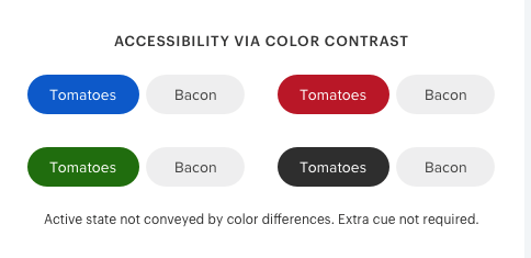
- Myth 1: The WCAG requirements are always optimal.
- Myth 2: Text needs to meet the AAA requirement, or it’s inaccessible.
- Myth 3: Interface components have the same contrast ratio standard as text.
As the calls for more accessibility increase, the need to know, understand, and accurately design for accessibility will be greatly enhanced by the reading of this article by @uxmovement.
Let us know what you think in the comments.


