
ARTICLE SUMMARY: When it comes to accessibility the first thing that comes to mind is color.
It does not matter what typography you use or how you use it, if the colors are not right your accessibility goes out the window.
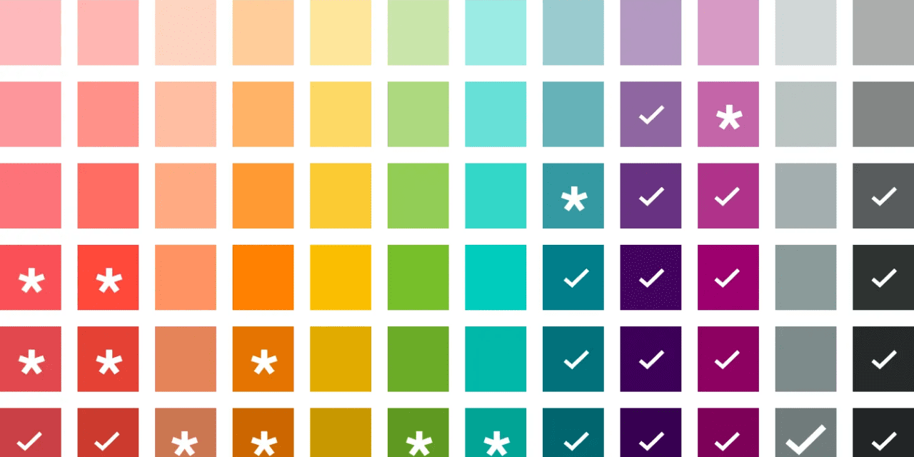
A new color system for accessibility can greatly improve the user experience for a wide range of people, including those with visual impairments or color vision deficiencies.
“Brightening up accessibility with a new color system” by Laura Soto Miranda is a look at the process used to revamp the company color system in an effort to improve accessibility. Some of the strategies discussed are
- The dark side of colors
- Fixing the foundations
- Bridging the brand and product experience
Why was it necessary to focus on colors? Colors play a major role in digital products and if you’re online you are global. It does not matter, global or local the last thing you want is to limit your target audience. It’s just good business that can only help your bottom line.
Remember, the goal of creating a new color system for accessibility is to make information and interfaces usable and understandable by as many people as possible. By considering the diverse needs of your users, you’re taking a significant step towards a more inclusive and welcoming digital environment.
This is a great article that will help you on your road to creating a more accessible website.
Let us know what you think in the comments.


