ARTICLE SUMMARY: Buttons are an essential element in user interfaces, and they play a crucial role in guiding and engaging users.
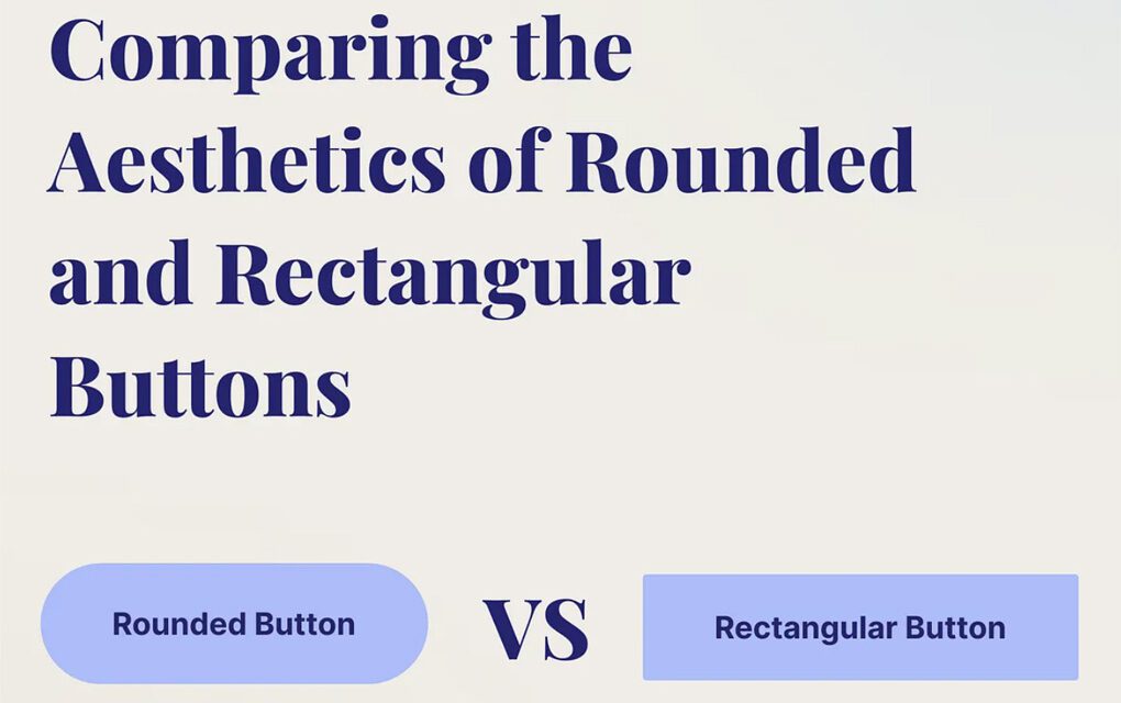
The aesthetics of rounded and rectangular buttons can evoke different visual and emotional responses, and their suitability often depends on various factors such as design context, target audience, and overall design goals.
It can be a little confusing on when and what button to use in your design, but, “Comparing the Aesthetics of Rounded and Rectangular Buttons” by Irfan Ullah Baig discusses the scenarios you should be thinking about when adding buttons to your design. He talks about
- Context
- Desired user experience
- Ideal use cases
Both styles have their own advantages and can be effectively used to create visually appealing and user-friendly interfaces.
The choice between rounded and rectangular buttons ultimately depends on the specific design requirements, the desired emotional response from users, and the overall aesthetic goals of the project.
This is a great article for new and seasoned designers alike.
Let us know what you think in the comments.


