
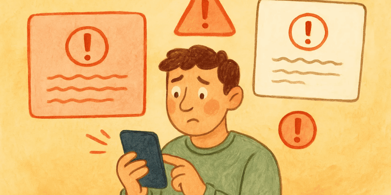
ARTICLE SUMMARY: OK, with a show of hands, how many of you would rather have a root canal than have to reset your password. We know not all sites are that bad, but when you get one that is, you just want say “the heck with this, I’m outta here.”
We have all experienced this at one time or another, and depending on the situation, you have to go through the process whether you like it or not. Nothing says ‘poor design’ quite like that.
“Error handling – UX design patterns” by Matan Rosen takes a hard look at this issue, why it happens, and more importantly, how to prevent it from happening in the first place. He talks about,
- Why error handling matters (more than you think)
- Principles for designing helpful, human, and even charming errors
- Real examples of what not to do, and how to do it better
Designers need to be careful, the way they handle errors can make or break user trust, one of the most valuable commodities a website can have. And once broken, trust is an extremely hard thing to restore.
In closing Matan reminds us, “Error handling may look like a small detail in UX, but it’s where products often reveal their true character. A poorly written error can frustrate and alienate, while a thoughtful one that shows the right mitigation can reassure, guide, and even strengthen trust.”
This is a great read for all designers, especially those just starting out. Let us know what you think in the comments.


