
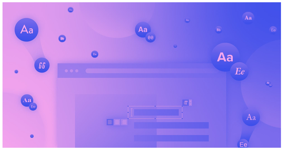
ARTICLE SUMMARY: As designers we know typography plays an important role in the success of your design.
Choosing fonts for your website can be frustrating at times, especially when it comes to font pairing. When pairing fonts you want fonts that compliment each other rather than distract from one another. You want a pairing that enhances the reading experience for the visitor to your site.
“FONT PAIRING: HOW TO FIND THE RIGHT COMBINATIONS FOR YOUR WEB DESIGNS” written by Jeff Cardello is helping you take the guess work out of font pairing and how to enhance the readability of your website. Some of Jeff Cardello‘s rules for font pairing are
- Use fonts that have different tones
- Limit different typefaces to three or less
- Communicate visual hierarchy through font pairing
These and his other rules give the designer a foundation for understanding typography and how to use font pairing in your design that will help you create a website visitors will enjoy reading and possibly end up spending more time there.
Jeff Cardello closes out with this advice, “There are so many aspects of effective web design. Approach your font pairings with the same level of consideration you apply to choosing a color palette. The tone of the typefaces you pick, the way that you style them, and their legibility are all a huge part of a user’s experience with a web design. Find those fonts that speak to the personality of what you’re creating and give your visitors the best possible way to experience its content.”
This is well worth the read, let us know what you think in the comments.


