
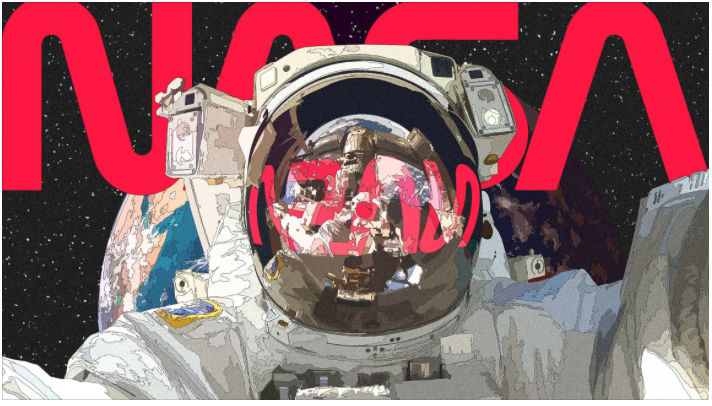
ARTICLE SUMMERY: This year, after the docking at the International Space Station by the private company SpaceX and 28 years after NASA retired the logo dubbed “The Worm“, the logo is back proving once again good design endures the test of time.
In Lilly Smith‘s article “NASA’S ‘WORM’ LOGO LAY DORMANT FOR 28 YEARS. SO WHY ARE PEOPLE SO OBSESSED WITH IT?” we get a look at what made people so obsessed with the NASA “Worm Logo” and how it has developed a cult following in the design world since it was adopted in 1975 by NASA.
Lilly Smith takes a look at how and why the “Worm Logo” came into being and why it eclipsed the popularity of the “Meatball Logo” it replaced.
The NASA “Worm Logo” is an example of how great design never really fades away, and while it is bringing back the worm, NASA will keep the meatball as it’s primary logo.
An interesting article and tribute to good design, let us know what you think in the comments


