
ARTICLE SUMMARY: There are over half a million type fonts out there just waiting to be used in your infographic.
Talk about causing stress over which font or fonts to use just might be an understatement. As designers we know that the wrong choice in type can sink a project faster than the Titanic possibly causing the loss of revenue or clients or both.
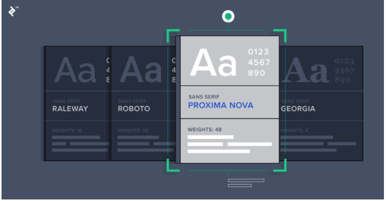
Cameron Chapman‘s “TIPS WHEN CHOOSING A TYPEFACE (WITH INFOGRAPHIC)” is a good “how to” pick a font or fonts for your next infographic with confidence. Some of the considerations discussed are
- Scope
- Mood
- Style
- Functionality
This is a few of the thirteen things to look at when designing your infographic. Each topic is closely examined and examples given to help you create an infographic that will stand out and be noticed by your target audience. Cameron Chapman reminds us that “Experimentation and practice are both important to mastering typeface selection. But there are a few things designers can keep in mind to make typeface selection easier and more focused.”
This article is well worth reading, let us know what you think in the comments.


