
ARTICLE SUMMARY: Working with color can be a challenge depending on what you are trying to achieve..
Like all design you have to take into consideration a lot of factors when it comes to color, am I using it for background, type, duotones or charts or maps, and that’s just for starters.
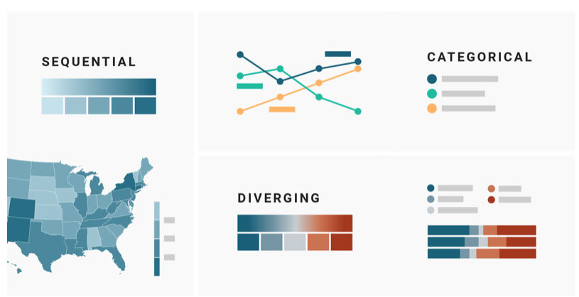
“WHICH COLOR SCALE TO USE WHEN VISUALIZING DATA” is a four part series that delves into designing for Data and how to use color in the most effective way to make it easier to disseminate large amounts of information in a shorter amount of time.
Some of the topics Lisa Charlotte Rost teaches us about are
- Categorical Color Scales
- Sequential Color Scales
- Highlighting/De-Emphasizing
Lisa Charlotte Rost tells us “that the decision of which color scale to use is often not as obvious as many of these data vis books make us believe.” This series will give designers a guide on how to proceed when planning how to present your design for data visualization.
Whether your a beginning designer or seasoned professional this is a must have tool in you design tool box.
Let us know what you think in the comments.


