
ARTICLE SUMMARY: No question, type is crucial to your design. Whether it’s a message or a product, if they can’t read it you can’t sell it.
Before computers it was fairly straight forward, newspapers and magazines basically used the same type, different sizes, but basically the same. The ads were fairly simple, large type or KO type, easy to read and not visually complicated.
With the advent of computers and the internet things have changed dramatically, you now have a bigger, more diverse audience and the tools to help you be more creative than ever before.
As designers we know that along with all these new creative technologies we have we need to be mindful of how to communicate with our target audience in a way that will hold their attention.
“How type influences readability” by Hilary Palmen is a deep dive into the why’s and wherefores of type and how it should be used. To give you a better understanding she looks into the importance of
- Legibility and readability
- The process of learning to read
- Reader’s interactions with words
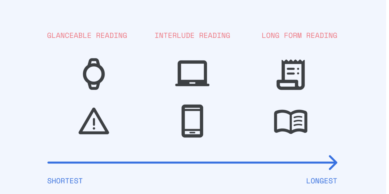
Reading is a complex cognitive process that must be given serious consideration when we design if we want to be successful in reaching, holding and engaging our target audience. Whether it’s “long form” reading, “glance” reading or “interlude” reading we should know how to design for all three.
Hilary closes her article by telling us “The best solution for choosing a readable typeface will always be dependent on who your readers are, their motivations, and the message that you want them to take from your type choices.”
At end of this article is an extensive list of resources that will enhance your knowledge of type and how to use it.
This is well worth the read, please let us know what you think in the comments.


