
ARTICLE SUMMARY: Every so often you come across something that is educational. Every so often you come across something that is fun. And on rare occasions you come across something that is both educational and fun, this is both.
Design Hacks has posted “Learn the logic of great typography” in an effort to help designers sharpen their skills and make better choices on how you choose and use type. Some of the topics covered in this exercise are
- CHOOSING A BODY FONT
- LINE LENGTH
- FONT SIZE
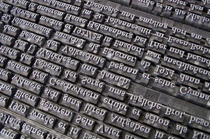
Typography is one of those topics you never stop learning, there is always room for improvement no matter how long you have been designing.
When building websites aesthetics count, and a big part of those aesthetics is typography. If it’s hard to read or not pleasing to the eye people will not spend the time of day to see what you’re proposing let alone the 5.9 seconds the average person spends looking at the site before deciding to move on or not.
This is a great tutorial for beginning and seasoned designers alike.
Go ahead, give it a shot and test your knowledge.
Let us know what you think in the comments.


