
ARTICLE SUMMERY: In it’s most ethical form the purpose of design is to solve problems and improve the lives of people. Nowhere is that more evident than the New York City subway system.
“NEW YORK SUBWAY MAP IS NOW ANIMATED” by Daniel Piper, shares a video of Felipe Memoria, a partner of Work & Co talking about the history of subway maps from 1904 to their creation today and why they created it.
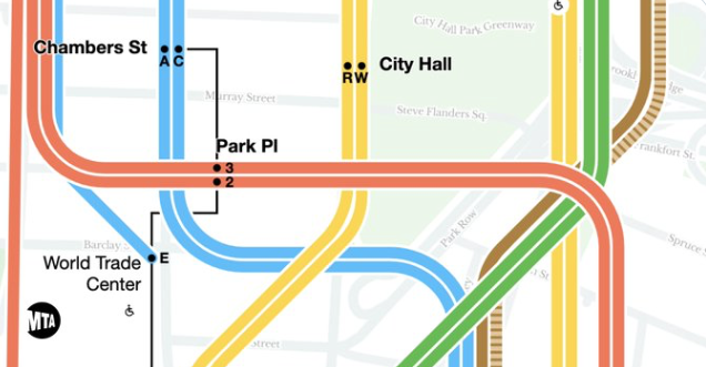
Before the animated subway map you would have to find a map on the wall to see where you were and where you were going, check four of five posters to make sure there were no changes in the schedule that day, and hope there were no changes to the changes that were not posted on the wall yet.
The animated map allows you to
- See schedule changes in real time
- Make informed future travel plans
- View in real time your train location
The “NEW YORK SUBWAY MAP IS NOW ANIMATED” is a story of how design and technology has enhanced the life of 5.9 million straphangers in New York City and a prime example of things to come when you combine design and technology.
It is a very interesting story on how the re-design came about and well worth a perusal, let us know what you think in the comments.


