
ARTICLE SUMMARY: If you are a printer, graphic artist, designer or an illustrator you all will have one thing in common, the Pantone Matching System.
In the history of design and printing the Pantone Matching System is still relatively new, developed in the 1950s, but the benefit it has had across multiple industries is worth writing about.
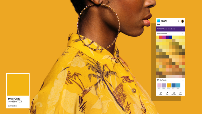
“Pantone: a revolution in the designers’ world” by Ksenia Malakhoff is a look at the history of Pantone Colors and how it was developed and the positive influence it has had on branding and especially printing.
One of the benefits of the Pantone Matching System is world wide color consistency, especially in branding. Print shops and ad agencies around the globe can mix ink with confidence that the spring green color printed in Germany will be the exact same spring green printed in the United States.
Also interesting was that starting from 2000, the Pantone Color Institute introduced a color award, called “Color of the Year”. Since then, the Color of the Year has had quite a big influence in the marketplace affecting all the products from graphic and web design to the fashion pieces sold at department stores.
It’s always good to look back and learn how ideas are developed. You never know when looking back will give you an idea for the next big innovation.
This article is well worth the read, let us know what you think in the comments.


