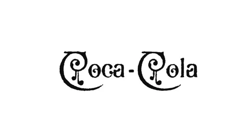
ARTICLE SUMMARY: THE Coca-Cola logo is one of the most recognizable logos on the face of the earth. It does not matter what country your in, Coca-Cola with it’s distinctive red and white flowing script logo is there on the store shelves.
Even though the logo has been around since 1887 the changes have been minimal.
“The Coca-Cola logo: a history from 1886 to today” by Joseph Foley looks at each iteration of the logo and what they were and the effects of those changes.
Many of the big brands over the years have simplified and modernized their logos. Coca-Cola on the other hand has not changed much at all taking advantage of its brand recognition that might have been lost in a radical re-design.
As Joseph Foley says, “The Coca-Cola logo is an incredible example of how a logo can endure against changes in fashion and requirements over the years.” What we designers should strive for.
This is a great article and well worth reading.
Let us know what you think in the comments.


