
ARTICLE SUMMARY: We love our smart phones, they are portable, they hold a boatload of information, it gives us access to the internet and are a lot lighter than a desktop or the laptop computer your toting around.
The goal of designer is to design the best possible user experience between the users and your app.
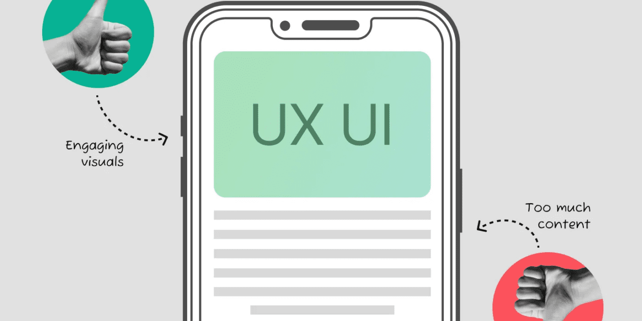
As devices get smaller and smaller “The Do’s and Don’ts of Mobile Design” is a guide on how to design for these smaller devices. There is a lot to consider when going from a desktop or laptop computer screen to a tablet or smart phone screen, designers have to
- Optimized load times
- Responsive design
- Intuitive navigation
UX design is crucial as it directly impacts user satisfaction, retention, and engagement. A well-designed UX enhances usability, increases user trust, and ultimately drives business success by fostering positive interactions and experiences.
This article looks at some of the top companies and the steps and missteps they have taken in their design journey to adapt to our rapidly changing devices we use. It pays to learn from others mistakes.
By following these do’s and don’ts, you can create a mobile UI/UX design that enhances user satisfaction and engagement and your bottom line.
This is a great article and resource to have handy for all designers.
Let us know what you think in the comments.


