
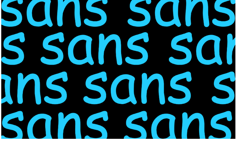
ARTICLE SUMMARY: In type fonts, as in art, the old saying goes beauty is in the eye of the beholder, but, when it comes to Comic Sans you either love it or hate it. With designers there doesn’t seem to be much middle ground on this when talking about this particular font.
“THE UGLY HISTORY OF COMIC SANS” by Michael Beausoleil takes a look at the history of Comic Sans and the basis for the strong feelings about this font and how that came about. He talks about
- Why it was created
- Is it ugly but helpful?
- The polarizing nature of Comic Sans
Holly and David Combs went as far as creating the Ban Comic Sans Manifesto for the purpose of banning the use of the font Comic Sans and preserve the quality and traditions of typography. Talk about dislike.
This is a very interesting insight into the Comic Sans love-hate relationship that designers have when it comes to this font. It is well worth reading. We will withhold our opinion on this for now, but we would like to know what you think of this in the comments.


