
ARTICLE SUMMARY: When it comes to web design there’s a boat load of things that comes into play and must be considered.
One of the designers top priorities is type, how you use it can make or break your website. People will not stay long on a website where information is disorganized or hard to follow the flow of information or the aesthetics are off.
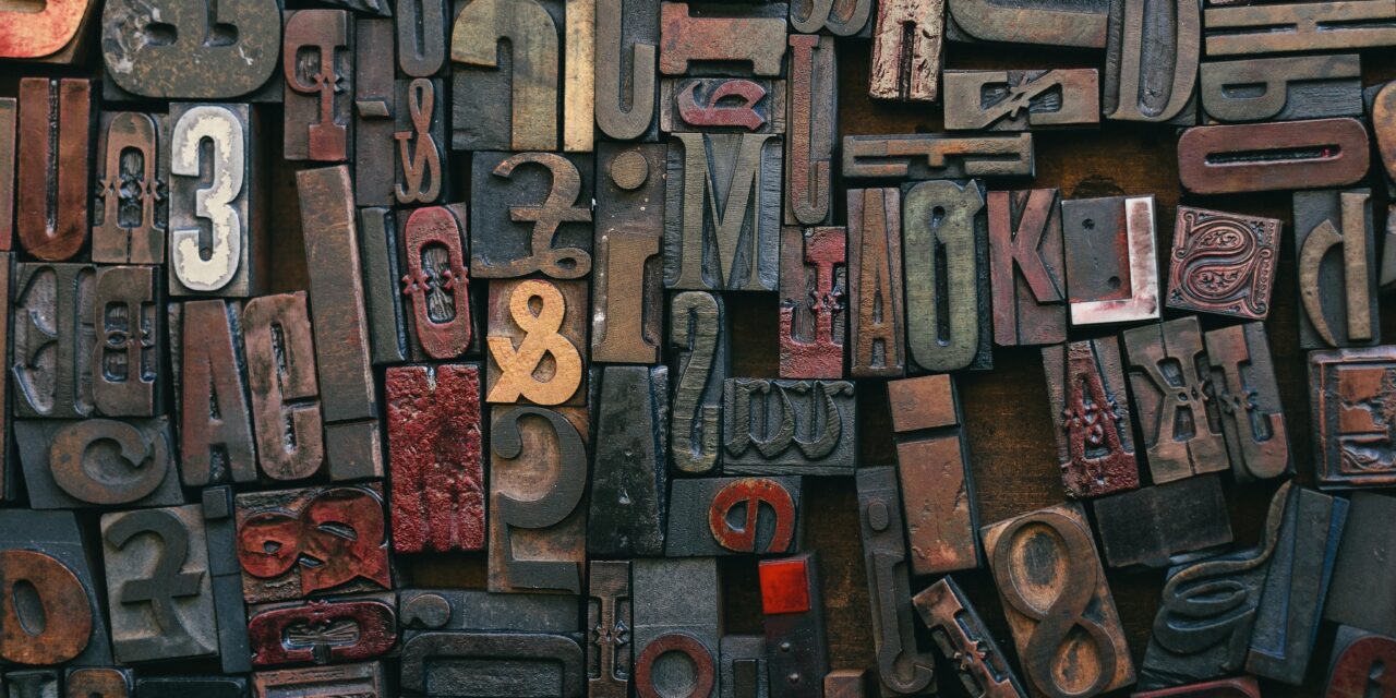
“Typographic Hierarchies” by Alma Hoffmann discusses the basic variables to establish a typographic hierarchy and how to apply it effectively to your design. Alma discusses
- What exactly is Type Hierarchy
- It’s use in grids
- Visual Punctuation
When building a website designers must realize that a website has less than 8 seconds to capture your ideal client and to give a great first impression. The average visitor to your site will decide whether or not to stick around in a 10-20 second window.
That’s not a whole heck of a lot of time to get and hold your target audience so your site has got to be good.
Alma Hoffmann concludes her article by reminding us that “The old adage has proven itself to be true consistently. It applies to typography and anything design. Fine-tuning our senses comes with exposure and repetition. Take any opportunity to design and establish a hierarchy. Even small things like a business card can look incredible when you add a contrast of space, weight, size, size and weight, color, and visual punctuation. “
This article covers a lot of ground and a good read for old and new designers alike and a good addition to your design toolbox.
Let us know what you think in the comments.


